Tag: layout

  • 빠른 UI 레이아웃을 위한 속독법

    빠른 UI 레이아웃을 위한 속독법

    • 가로(Horizontal), 세로(Vertical), 혼합(Mixed)의 흐름을 구분 짖는다.
    • 그에따른 각 섹션에 화살표로 방향을 정의한다.
    • 방향에 따른 개별 덩어리를 나눠 구분한다.
    • 섹션별 흐름의 우선순위를 결정한다.
    • 최대한 눈의 움직임을 단순하게 처리한다.
    • Visual path 기법을 통한 분석 적용 ( Gutenberg Diagram, Z-pattern and F-pattern)
    • 흐름에 맞게 전략과 콘텐츠를 채워나간다.
    • 각각의 그룹 컨테이너의 흐름에 강조할 그룹을 정의한다.

    데스크톱

    LSR(Layout Speed Reading) for Desktop

    모바일

    LSR(Layout Speed Reading) for Mobile
  • 웹 User flow의 원리

    웹 User flow의 원리

    웹 디자인을 위한 레이아웃 흐름(Flow)은 페이지를 통해 사용자를 안내하는 행위이다. 모든 사이트는 어떤 형태의 흐름이 있지만 일부는 다른 것보다 매우 효과적이다. 효과적인 흐름은 색상(Color), 요소의 크기(Size), 타이포그래피(Typography) 및 이미지(Image)와 같은 레이아웃과 직접적인 관련이 없는 속성을 포함하여 웹 디자인의 모든 측면을 취하게 된다.

    흐름(flow)

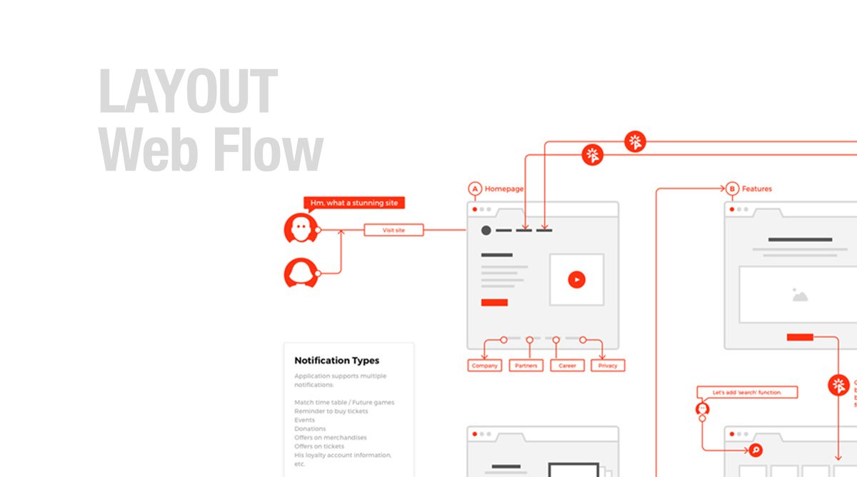
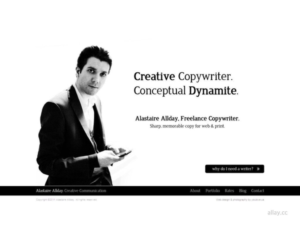
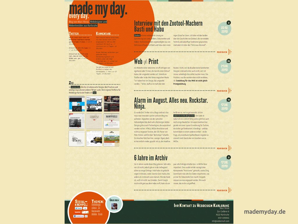
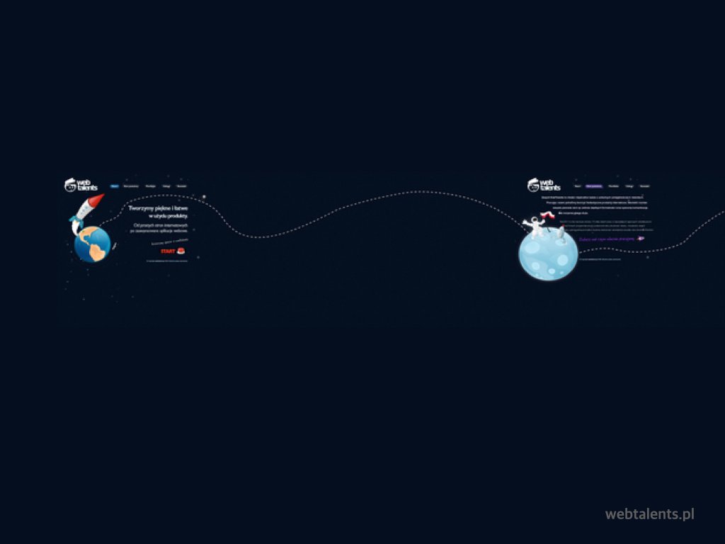
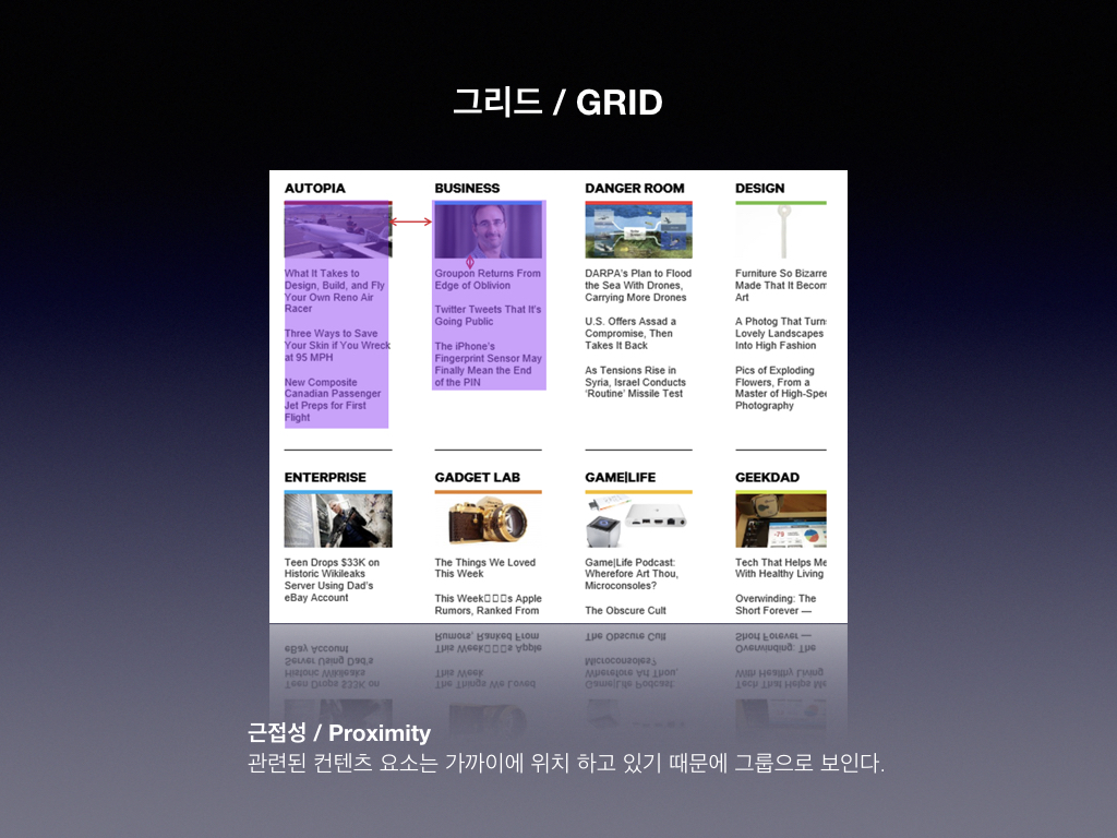
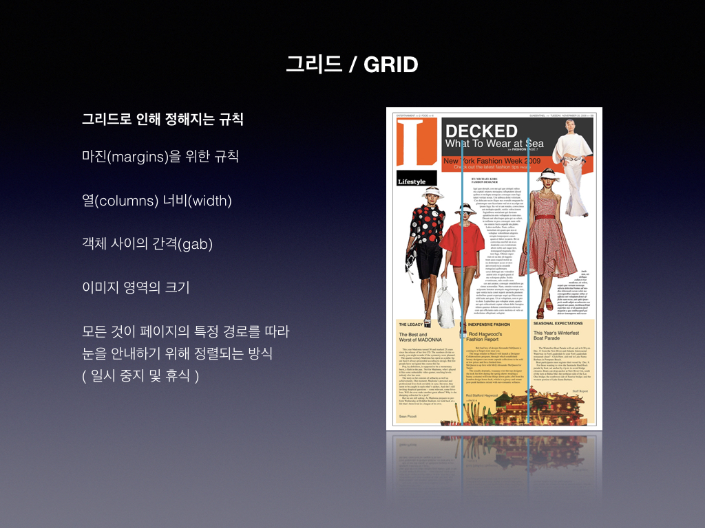
    스크린샷에서 볼 수 있듯이 페이지를 자연스럽게 읽는다. 사용자가 모든 콘텐츠를 볼 가능성이 높고 중요한 정보를 놓칠 가능성이 적기 때문에 좋은 예제이다.

    2, 3, 4, 5 및 6 지점에서 볼 수 있는 다음 섹션으로 방문자의 주의를 끌기 위해 이미지를 사용했다.

    인쇄술을 사용하면 3, 7, 8 및 10과 같이 다음 섹션으로 사용자를 안내할 수 있다.

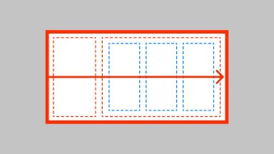
    수평 적색 선은 왼쪽에서 오른쪽으로 자연스러운 읽기 순서를 만드는 섹션을 정의하는 데 도움이 된다.
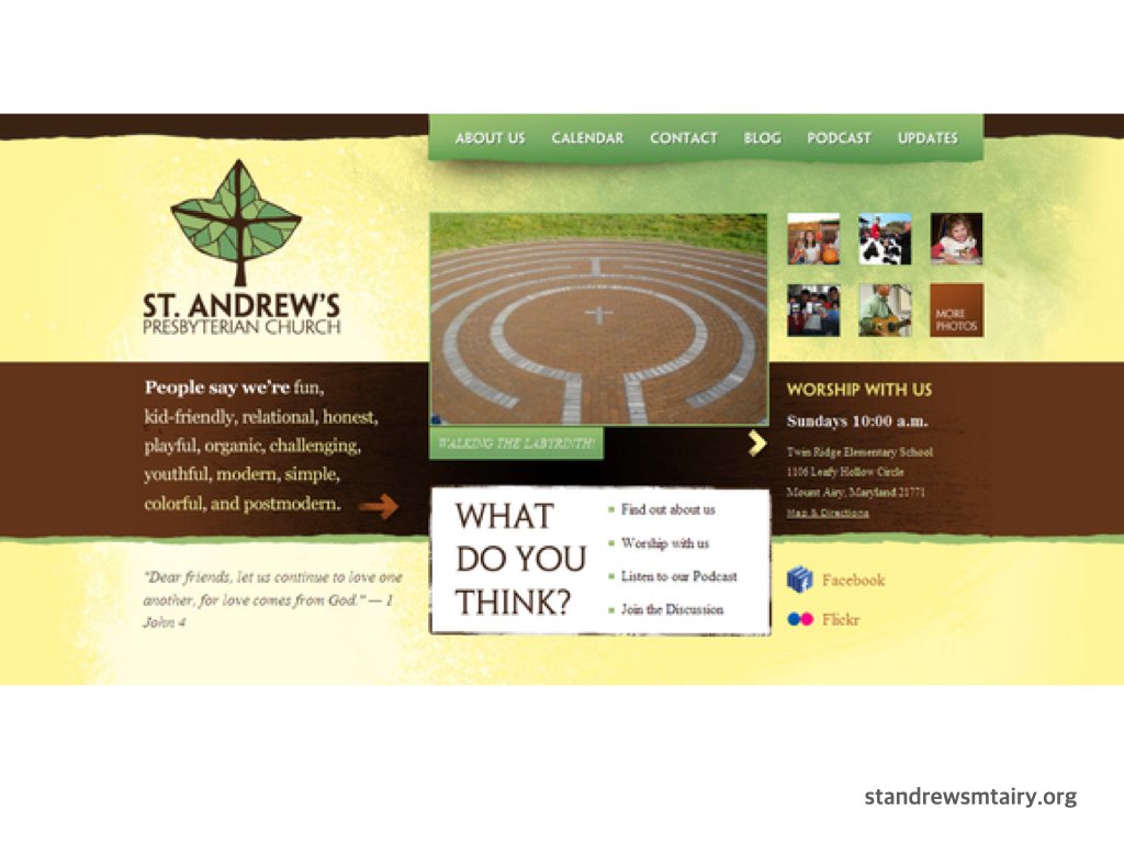
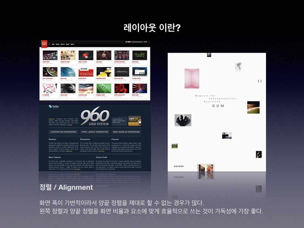
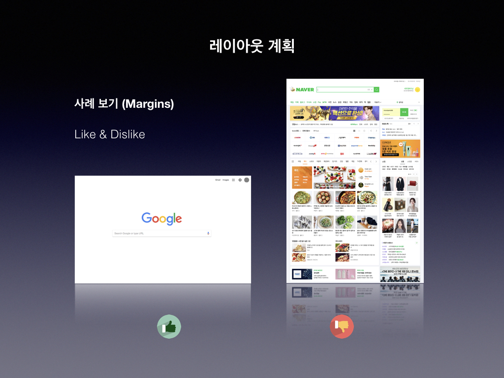
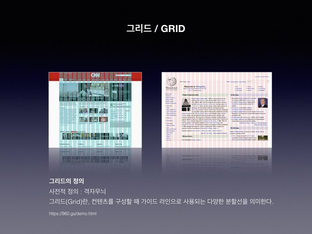
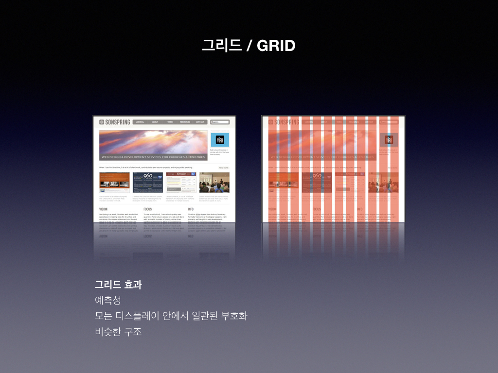
    정렬(Alignment)

    정렬은 좋은 흐름을 만드는데 도움이 된다. 옆의 예제에서 볼 수 있듯이, 정렬은 전반적인 흐름에서 중요한 역할을 한다. 정렬은 자연스러운 순서에 기여하여 내용을 쉽게 읽고 읽을 수 있게 하기 때문이다.

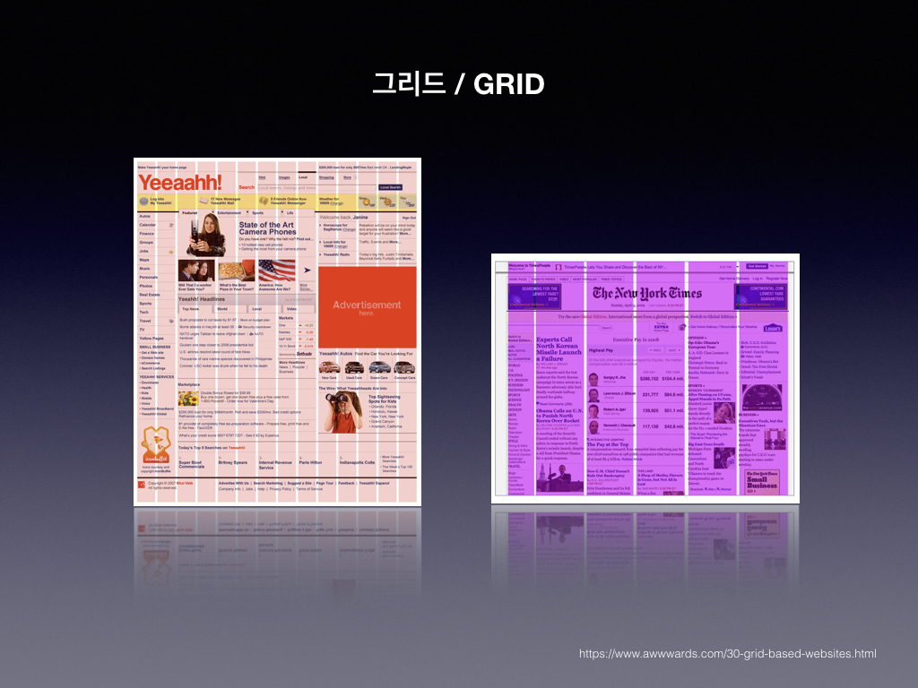
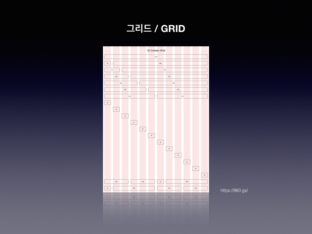
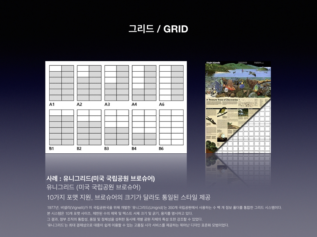
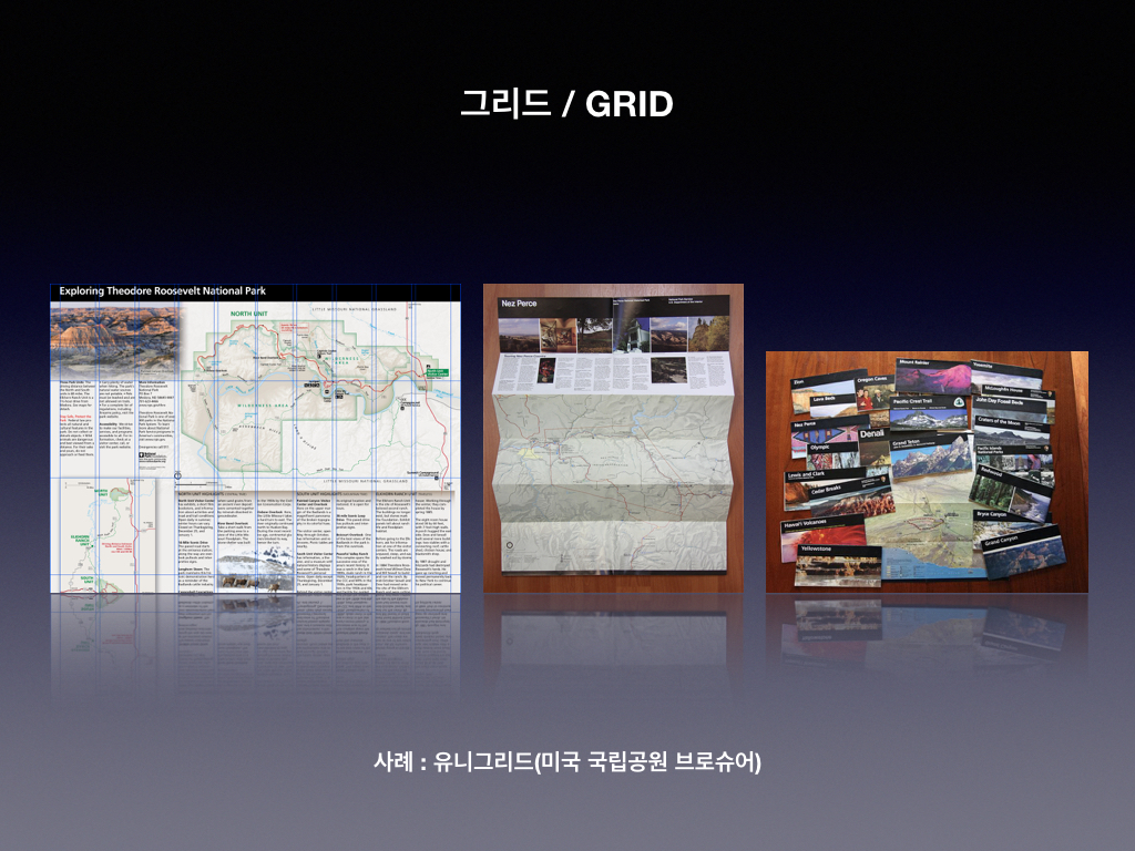
    이를 파악하는 가장 좋은 방법은 현재 사용되는 가장 일반적인 그리드 시스템이 있는 그리드 시스템을 사용하는 것이다. 예제에서 사용한 960 그리드 시스템이다.

    슬라이드 자료

  • UI 디자인 요소 Layout ①

    UI 디자인 요소 Layout ①

    GUI를 위한 레이아웃 접근을 효과적으로 디자인하기 위해서 몇 가지 알아야 할 사항을 정리해 본다.

    1. 스크린 이해
    2. 공간 확보와 화면분할
    3. 레이아웃 계획
    4. 그리드(Grid)
    5. 그리드 검사하기

    슬라이드 자료

  • HTML 레이아웃 표현 방법 ①

    HTML 레이아웃 표현 방법 ①

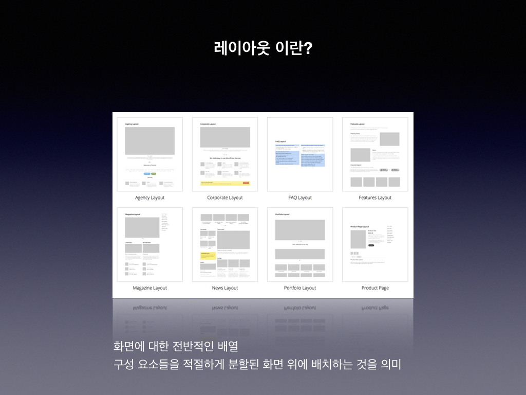
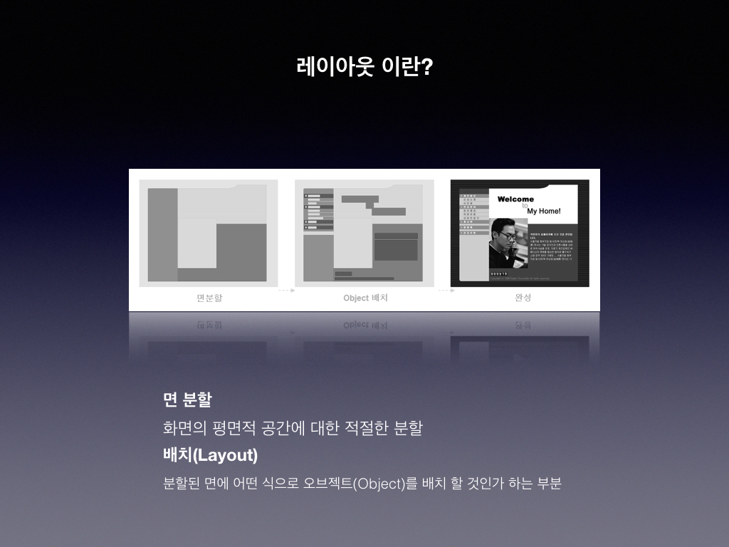
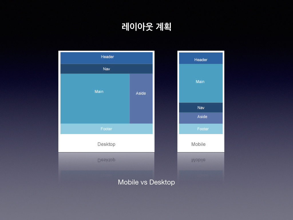
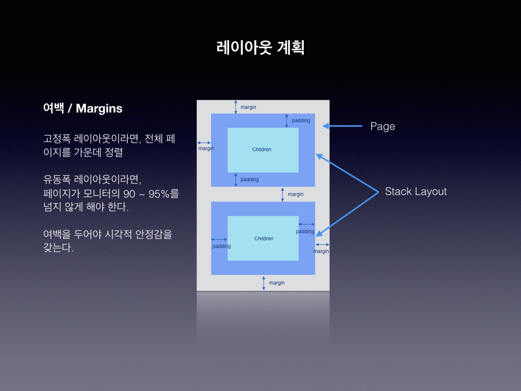
    레이아웃 접근에 있어서 기본적인 원리와 각 요소의 특성을 먼저 이해해야 복잡한 구성 요소로 된 레이아웃을 설계하고 디자인할 수 있습니다.

    너비(Widths) 및 높이(Heights) : width, height, max-width, min-height 등.

    <!DOCTYPE html>
    <html>
    <head>
        <meta charset="utf-8">
        <title>Widths and heights</title>
        <style>
            body {
                font-size: 20px;
                background: #fc0;
                color: #000;
            }
            p {
                background: white;
            }
    
            #p1 {
                width: 300px;
            }
            #p2 {
                height: 100px;
            }
            #p3 {
                width: 50%;
            }
            #p4 {
                max-width: 500px;
            }
            #p5, #p6 {
                min-height: 100px;
            }
        </style>
    </head>
    <body>
        <h1>Widths and heights</h1>
        <p>A bunch o' paragraphs…</p>
        <p id="p1"><code>width: 300px; /* and height is just the height of the content */</code></p>
        <p id="p2"><code>height: 100px; /* and width, on paragraphs like this one at least, is 100% by default */</code></p>
        <p id="p3"><code>width: 50%; /* 50% of the width of the paragraph's parent, which in this case is the body */</code></p>
        <p id="p4"><code>max-width: 500px; /* width of 100% (because that's the paragraph's default) but only up to 500 pixels */</code></p>
        <p id="p5"><code>min-height: 100px; /* At least 100 pixels high  */</code></p>
        <p id="p6"><code>min-height: 100px; /* This could be higher than 100 pixels. If a paragraph were to waffle on, about this, that, the other, about anything really, like, really, really, really waffle on, about elephants or bubbles or poached eggs or Russian dolls or antidisestablishmentarianism, for example, if, in those cases, in those waffley case, or, if, for (another) example, there wasn't actual waffle but genuine very necessary things to say, like if there was a sentence about elephants and a paragraph didn't in fact talk about bubbles or poached eggs or Russian dolls or antidisestablishmentarianism, or anything else for that matter, if, in that case, the paragraph were to detail tusks or pachyderms or trunks or anything elephant-related, then, although it could well still be waffle, there is also the chance that it could be very relevant and non-waffley but, in either case, the point is that content could go on, and on, and on, and on, and on, and, in such circumstances, a bog standard paragraph, waffle or not, could be rather long and could, quite reasonably, require a greater height than 100 pixels, waffle or not.  */</code></p>
    
    </body>
    </html>

    테두리(Borders) : Thick, thin, this color, that color, solid, dotted, dashed…

    <!DOCTYPE html>
    <html>
    <head>
        <meta charset="utf-8">
        <title>Borders</title>
        <style>
            body {
                font-size: 80%;
                color: #000; /* 명시적 색상이 없는 테두리는 이 색상 선언을 사용합니다. */
                margin: 0;
                padding: 0;
            }
        
            p {
                padding: 4em;
                margin: 2em;
            }
            
            code {
                font: 1em/1.5 Courier;
            }
        
            #border1 {  
                border: 1px solid;
                
            }
            
            #border2 {
                border: 1px dotted;
            }
            
            #border3 {
                border: 2px dashed #ccc;
            }
            
            #border4 {
                border: solid;
                border-width: 1px 5px 10px 15px;
            }
            
            #border5 {
                border: 5px;
                border-style: solid dotted dashed solid;
            }
            
            #border6 {
                border: 5px solid;
                border-color: black #444 #888 #ccc;
            }
            
            #borderKnu {
                border: 3px dotted #06c;
            }
        </style>
    </head>
    <body>
        
        <p id="border1"><code>border: 1px solid;</code></p>
        <p id="border2"><code>border: 1px dotted;</code></p>
        <p id="border3"><code>border: 2px dashed #ccc;</code></p>
        <p id="border4"><code>border: solid;<br>
                    border-width: 1px 5px 10px 15px;</code></p>
        <p id="border5"><code>border: 5px;<br>
                    border-style: solid dotted dashed solid;</code></p>
        <p id="border6"><code>border: 5px solid;<br>
                    border-color: black #444 #888 #ccc;</code></p>
        <p id="borderKnu"><img src="./img/knulab.png" alt="HTML KNULAB"></p>
        
    </body>
    </html>

    둥근 모서리(Rounded corners) : border-radius 속성 사용.

    <!DOCTYPE html>
    <html>
    <head>
        <meta charset="utf-8">
        <title>Rounded corners: border-radius</title>
        <style>
            body {
                font: 14px courier;
                background: #06c;
                color: #000;
            }
        
            p {
                width: 300px;
                height: 100px;
                padding: 50px;
                margin: 20px 0 0 20px;
                background: white;
                float: left;
            }
            code {
                display: block;
                padding: 10px;
                background: #def;
                border-radius: 10px;
            }
            #corners1 {
                border-top-left-radius: 100px;
            }
            #corners2 {
                border-radius: 100px;
            }
            #corners3 {
                border-radius: 0 50px 100px 200px;
            }
            #corners4 {
                padding: 30px;
                background: none;
                border-radius: 50px;
                border: 20px solid #fff;
            }
            #corners5 {
                border-radius: 25%;
            }
            #corners6 {
                border-radius: 200px/100px;
            }
            #borderKnu {
                border-radius: 75px/125px;
                border-bottom-left-radius: 75px;
                border-bottom-right-radius: 75px;
                width: 120px;
                height: 90px;
                padding: 80px 15px 30px 15px;
            }
        </style>
    </head>
    <body>
        <p id="corners1"><code>border-top-left-radius: 100px;</code></p>
        <p id="corners2"><code>border-radius: 100px;</code></p>
        <p id="corners3"><code>border-radius: 0 50px 100px 200px;</code></p>
        <p id="corners4"><code>border-radius: 50px;<br>border: 20px solid #fff;</code></p>
        <p id="corners5"><code>border-radius: 25%;</code></p>
        <p id="corners6"><code>border-radius: 200px/100px;</code></p>
        <p id="borderKnu"><img src="./img/knulab.png" alt="HTML KNULAB"></p>
    </body>
    </html>

    박스 그림자(Box shadows) : pop 추가.

    <!DOCTYPE html>
    <html>
    <head>
        <meta charset="utf-8">
        <title>Box shadows</title>
        <style>
            body {
                font: 14px courier, monospace;
                padding: 25px;
                margin: 0;
                background: #edc;
                color: #000;
            }
        
            p {
                width: 400px;
                height: 50px;
                padding: 50px;
                margin: 25px;
                background: white;
                float: left;
            }
            #shadow1 {
                box-shadow: 5px 5px;
            }
            #shadow2 {
                box-shadow: 5px 5px 3px 1px #999;
            }
            #shadow3 {
                box-shadow: 5px 5px 3px 1px rgba(0,0,0,.4);
            }
            #shadow4 {
                box-shadow: 0 0 10px 0 rgba(0,0,0,.4);
            }
            #shadow5 {
                box-shadow: inset 0 0 10px 0 rgba(0,0,0,.4);
            }
    
    
            #shadowKnu {
                width: 120px;
                height: 90px;
                padding: 30px 40px;
                box-shadow: 0 0 20px 5px #06c;
            }
        </style>
    </head>
    <body>
        <p id="shadow1"><code>box-shadow: 5px 5px;</code></p>
        <p id="shadow2"><code>box-shadow: 5px 5px 3px 1px #999;</code></p>
        <p id="shadow3"><code>box-shadow: 5px 5px 3px 1px rgba(0,0,0,.4);</code></p>
        <p id="shadow4"><code>box-shadow: 0 0 10px 0 rgba(0,0,0,.4);</code></p>
        <p id="shadow5"><code>box-shadow: inset 0 0 10px 0 rgba(0,0,0,.4);</code></p>
        <p id="shadowKnu"><img src="./img/knulab.png" alt="HTML KNULAB"></p>
    </body>
    </html>

    여백 축소(Margin collapsing) : 수직 여백이 서로 병합 또는 “collapse”되는 방식.

    <!DOCTYPE html>
    <html>
    <head>
        <meta charset="utf-8">
        <title>Margin collapsing</title>
        <style>
            div {
                background: #666;
                margin: 1em;
            }
        
            div p {
                margin: 1em;
                background: #ccc;
            }
    
            #two {
                border: 1px solid black;
            }
        </style>
    </head>
    <body>
    
        <div>
            <p>Lorem ipsum dolor sit amet, consectetur adipisicing elit, sed do eiusmod tempor incididunt ut labore et dolore magna aliqua. Ut enim ad minim veniam, quis nostrud exercitation ullamco laboris nisi ut aliquip ex ea commodo consequat. Duis aute irure dolor in reprehenderit in voluptate velit esse cillum dolore eu fugiat nulla pariatur. Excepteur sint occaecat cupidatat non proident, sunt in culpa qui officia deserunt mollit anim id est laborum.</p>
        </div>
        <div id="two">
            <p>Lorem ipsum dolor sit amet, consectetur adipisicing elit, sed do eiusmod tempor incididunt ut labore et dolore magna aliqua. Ut enim ad minim veniam, quis nostrud exercitation ullamco laboris nisi ut aliquip ex ea commodo consequat. Duis aute irure dolor in reprehenderit in voluptate velit esse cillum dolore eu fugiat nulla pariatur. Excepteur sint occaecat cupidatat non proident, sunt in culpa qui officia deserunt mollit anim id est laborum.</p>
        </div>
    
    </body>
    </html>

    윤곽선(Outlines) : 테두리의 “경계선”

    <!DOCTYPE html>
    <html>
    <head>
        <meta charset="utf-8">
        <title>Outlines</title>
        <style>
            * {
                margin: 0;
            }
            body {
                margin: 20px;
                padding: 20px;
            }
            h1 {
                font-size: 80px;
            }
            pre {
                padding: 20px;
                border: 20px dotted;
                outline: 20px solid red;
                margin: 40px 0;
            }
            p {
                font-size: 40px;
                outline-color: #999;
                outline-style: dashed;
                outline-width: thin;
                margin: 40px 0;
            }
            p strong {
                outline: 20px double rgba(0,255,0,.2);
            }
            
            #borderKnu {
                outline: 0;
            }
            #borderKnu a {
                outline: medium solid rgba(0,0,255,.1);
                transition: outline 1s;
            }
            #borderKnu a:hover {
                outline: 400px solid rgba(0,0,255,.9);
            }
        </style>
    </head>
    <body>
    
        <h1>Outlines</h1>
    
        <pre><code>padding: 20px;
    border: 20px dotted;
    outline: 20px solid red;</code></pre>
    
        <p>The width, style, and color of the outline around a box. An outline is rendered around the outside of the border of a box. <strong>It does not affect the size or position of the box, or any other box.</strong></p>
        <p id="borderKnu"><a href="#"><img src="./img/knulab.png" alt="HTML KNULAB"></a></p>
    
    </body>
    </html>

    오버플로(Overflows) : 상자 안에 들어 가지 않는 콘텐츠 부분을 관리

    <!DOCTYPE html>
    <html>
    <head>
        <meta charset="utf-8">
        <title>Overflow</title>
        <style>
            body {
                font-size: 25px;
                background: #dcb;
                color: #000;
                margin: 20px;
            }
        
            p {
                background-color: #fff;
                margin: 0 20px 90px 0;
                width: 300px;
                height: 90px;
                float: left;
                line-height: 1.4;
            }
            code {
                color: #c00;
            }
    
            #p1 {
                overflow: visible;
            }
            #p2 {
                overflow: hidden;
            }
            #p3 {
                overflow: scroll;
            }
            #p4 {
                overflow: auto;
            }
            #htmlknu {
                overflow: auto;
            }
    
            #htmlknu a {
                display: block;
                text-align: center;
            }
        </style>
    </head>
    <body>
    
        <h1><a href="#">CSS Property: <code>overflow</code></a></h1>
        <p id="p1"><code>overflow: visible</code>: Non-fitting content spills outside of the edges of the box for all to see. Default.</p>
        <p id="p2"><code>overflow: hidden</code>: Box is clipped, non-fitting content is unseen and the browser does not offer a way to see it.</p>
        <p id="p3"><code>overflow: scroll</code>: Box is clipped, non-fitting content is initially unseen and the browser offers up a scrolling mechanism (or equivalent) so that the it can be seen upon user interaction.</p>
        <p id="p4"><code>overflow: auto</code>: Browser dependent, but typically similar to <code>scroll</code>.</p>
        <p id="htmlknu"><a href="#"><img src="./img/knulab.png" alt="HTML KNULAB"></a></p>
    
    </body>
    </html>

    블록(Block) 및 인라인(Inline) 1 : display 속성을 사용하여 상자의 비헤이비어(behavior) 변경.

    <!DOCTYPE html>
    <html>
    <head>
        <meta charset="utf-8">
        <title>Block and inline boxes 1</title>
        <style>
            body {
                font: 80% arial, helvetica, sans-serif;
            }
            
            h1 {
                font-size: 1.5em;
            }
            
            h2 {
                font-size: 1em;
            }
            
            code {
                font-family: courier;
            }
            
            #example1, #example2 {
                background: #ccc;
                border: 2px solid black;
            }
    
            span {
                background: white;
                display: block;
            }
            
            span.altern8 {
                background: #5b5;
            }
            
            #example2 span {
                display: inline;
            }
        </style>
    </head>
    <body>
    
        <h1>Block and inline boxes</h1>
        <p>Each of these examples contains the same HTML, but the elements in the first are set to <code>display: block</code> and the elements in the second are set to <code>display: inline</code>.</p>
    
        <h2>Block</h2>
        <p id="example1"><span>This</span><span class="altern8">That</span><span>The Other</span><span class="altern8">4</span></p>
    
        <h2>Inline</h2>
        <p id="example2"><span>This</span><span class="altern8">That</span><span>The Other</span><span class="altern8">4</span></p>
    
    </body>
    </html>

    블록(Block) 및 인라인(Inline) 2 : 블록 및 인라인 상자 간의 차이가 더 큽니다.

    <!DOCTYPE html>
    <html>
    <head>
        <meta charset="utf-8">
        <title>Block and inline boxes 2</title>
        <style>
            body {
                font: 80% arial, helvetica, sans-serif;
            }
            
            h1 {
                font-size: 1.5em;
            }
            
            h2 {
                font-size: 1em;
            }
            
            code {
                font-family: courier;
            }
            
            #example1, #example2 {
                background: #ccc;
                border: 2px solid black;
            }
    
            span {
                background: white;
                display: block;
                border: 0.5em solid red;
                padding: 1em;
                margin: 0.5em;
            }
            
            span.altern8 {
                background: #5b5;
            }
            
            #example2 span {
                display: inline;
            }
        </style>
    </head>
    <body>
    
        <h1>Block and inline boxes (with padding, border and margin)</h1>
        <p>Each of these examples contains the same HTML, but the elements in the first are set to <code>display: block</code> and the elements in the second are set to <code>display: inline</code>.</p>
    
        <h2>Block</h2>
        <p id="example1"><span>This</span><span class="altern8">That</span><span>The Other</span><span class="altern8">4</span></p>
    
        <h2>Inline</h2>
        <p id="example2"><span>This</span><span class="altern8">That</span><span>The Other</span><span class="altern8">4</span></p>
    
    </body>
    </html>

    블록(Block) 및 인라인(Inline) 3 : display: inline-block 적용

    <!DOCTYPE html>
    <html>
    <head>
        <meta charset="utf-8">
        <title>Block and inline boxes 3</title>
        <style>
            body {
                font: 80% arial, helvetica, sans-serif;
            }
            
            h1 {
                font-size: 1.5em;
            }
            
            h2 {
                font-size: 1em;
            }
            
            code {
                font-family: courier;
            }
            
            #example2, #example3 {
                background: #ccc;
                border: 2px solid black;
            }
    
            span {
                background: white;
                display: inline;
                border: 0.5em solid red;
                padding: 1em;
                margin: 0.5em;
            }
            
            span.altern8 {
                background: #5b5;
            }
            
            #example3 span {
                display: inline-block;
            }
        </style>
    </head>
    <body>
    
        <h1>Block and inline boxes (with padding, border and margin)</h1>
        <p>Each of these examples contains the same HTML, but the elements in the first are set to <code>display: inline</code> and the elements in the second are set to <code>display: inline-block</code>.</p>
    
        <h2>Inline</h2>
        <p id="example2"><span>This</span><span class="altern8">That</span><span>The Other</span><span class="altern8">4</span></p>
    
        <h2>Inline-Block</h2>
        <p id="example3"><span>This</span><span class="altern8">That</span><span>The Other</span><span class="altern8">4</span></p>
    
    </body>
    </html>