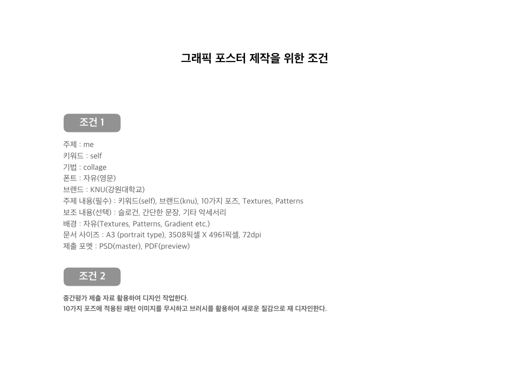
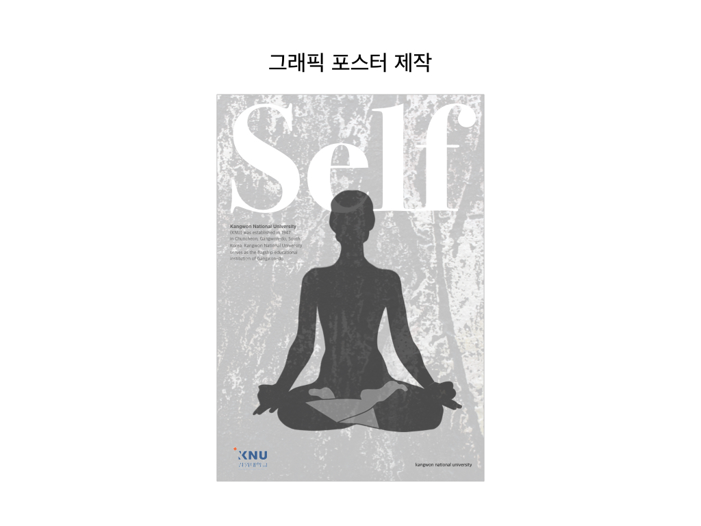
타이포그래피(Typography)는 활자 서체의 배열을 말하는데, 특히 문자 또는 활판적 기호를 중심으로 한 2차원적 표현을 가리킨다. 활판으로 하는 인쇄술을 가리키는 용어이기도 하다. 오늘날에는 뜻이 바뀌어 사진까지도 첨가하여 구성적인 그래픽 디자인 전체를 가리키고 일반의 디자인과 동의어 같이 쓰이는 일도 있다. 즉, 편집 디자인 분야에서는 활자의 서체나 글자 배치 따위를 구성하고 표현하는 일을 가리키는 용어이다.
서양의 활판술 발명 이전의 양식을 지금도 계승하고 있으나 바우하우스를 중심으로 하는 근대 타이포그래피는 구성주의적인 창작에 의하여 옛 형태를 타파하고, 점차 기능적인 표현을 행하여 디자인의 한 분야가 되었다. 한편 조본(造本)을 중심으로 하는 고전적인 기법과 유기적·유동적인 아메리칸 타이포그래피 등도 있다.
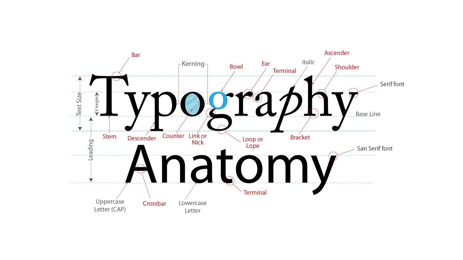
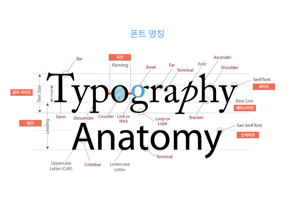
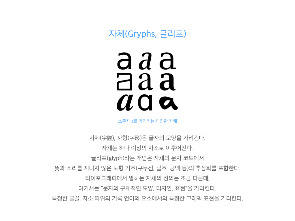
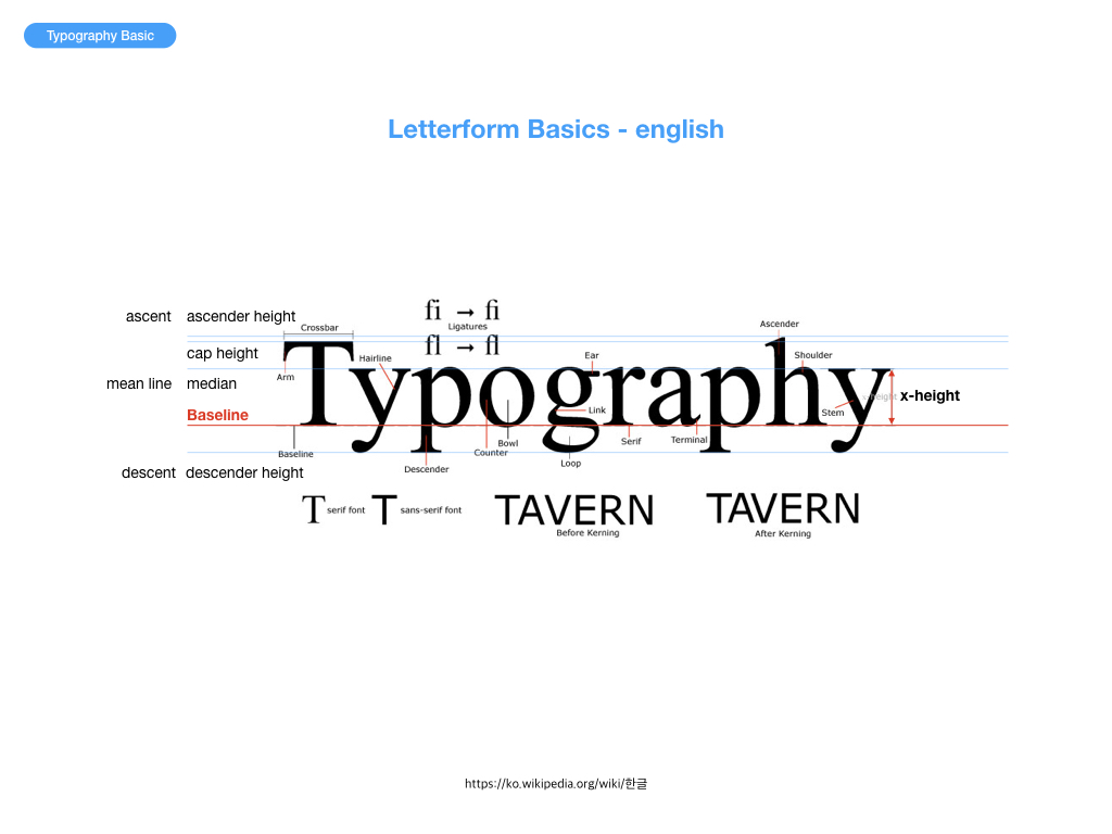
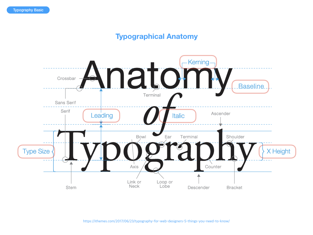
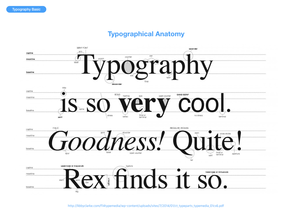
타이포그래피는 문자 배열, 문자 디자인과 문자 상형을 수정하는 기술과 예술이다. 상형문자는 창조되고 다양한 일러스트레이션 기법으로 수정된다. 글자의 정돈은 서체의 선택, 포인트 사이즈, 선 길이, 선 간격, 문장 사이의 간격 맞춤과 단어 사이의 간격 맞춤을 포함한다.
타이포그래피는 도판공 타입세터, 컴포지터, 타이포그래퍼, 그래픽 디자이너, 아트 디렉터, 코믹 북 아티스트, 그래피티 아티스트와 서기관에 의해 표현된다. 디지털 시대까지, 타이포그래피는 전문적인 직업이었다. 디지털화되어 시각 디자이너와 설계자의 타이포그래피의 새로운 시대가 열렸다.
그래픽 디자이너들은 타이포(typo)라는 단어를 많이 사용한다. ‘타이포’? 도대체 뭐지? 무엇을 이야기하기 위해 ‘타이포’라는 단어를 사용하지? 타입디자인… 타이포그래피… 타입페이스… 타이포그래픽… 타이포그래퍼? 도통 알 수가 없다. 디자인을 전공하는 학생들 사이에서 ‘타이포’라는 단어를 큰 문제없이 사용하곤 한다. 학생들이 ‘타이포’라는 단어를 서슴없이 아무때나 사용하는데는 학교 디자인 교육에 큰 책임이 있다. 편집, 패키지, CI, 그래픽 디자인 등 타이포그래피를 응용한 과목을 강의하는 선생님들 중 일부는 서슴없이 ‘타이포’라는 단어를 사용하기 때문이다. 심지어 몇몇 타이포그래피를 가르치는 선생님들도 ‘타이포’ 라는 단어를 큰 구분 없이 사용하는 경우를 볼때가 있다. 일부 그래픽 디자이너와 학생들은 타이포(typo)라는 단어를 보통 ‘타이포그래피(typography)’의 줄임말로 사용하는 듯하다. 하지만 ‘타이포(typo)’라는 표현이 정말 맞는 것일까?
잘못된 단어의 사용은 타이포그래피를 좀 더 전문적으로 공부하려는 학생들이나 디자이너들에게 많은 의문을 갖게 한다. 하나의 학문을 깊게 공부할수록 단어에 대한 의미나 표현은 굉장히 중요해지기 때문이다. 특히 시각디자인을 전공하는 사람들에게 ‘타이포그래피’는 절대 간과할 수 없는 부분이기 때문에 이 부분을 심각하게 생각해 볼 필요가 있다. 이 글에서는 Type 과 Typo의 단어적 의미와 타이포그래피와 관련된 용어들의 의미에 대해서 이야기해 보고자 한다.
일반적으로 디자인 현업에 종사하는 디자이너들 중 ‘타이포그래피’나 ‘타입페이스’ 혹은 ‘타입 디자인’을 뭉뚱그려 ‘타이포(Typo)’라고 말하는 경우가 있다. 예를 들어 학교 과제에서 ‘타입페이스’가 어울리지 않거나, 디자인 작업에서 타이포그래피에 문제가 있을때 “타이포가 잘못되었다”라고 이야기 한다. 이미 이런 상황에서 ‘타이포’라는 표현은 일반화되어 많은 디자이너 사이에서 아무 문제나 의심 없이 사용되고 있다. 하지만, 우리는 타이포라는 단어의 본래 의미에 맞게 사용하고 있었던 것일까? 우선 사전적 의미를 알아보자.
위의 사전적 의미에서도 알 수 있듯 타이포(typo)는 인쇄공(타이포그래퍼)와 오식(오탈자)을 이야기한다. 전자 인쇄공을 현대적 의미와 시각디자인 전문분야의 의미로 해석하면, 디자인된 글꼴을 다루고 활용하는 사람 즉, ‘타이포그래퍼’로 이해할 수 있다. 하지만 후자인 오탈자의 의미로 사용되는 경우도 있기 때문에 ‘타이포’ 표현은 앞뒤 상황을 고려하지 않는다면 표현상의 큰 오류이다. 그렇다면, 이어서 Type에 대한 사전적 의미도 알아보자.
type 5. [집합적] 【인쇄】 활자;자체;인자체(印字體)
(출처) 네이버 사전
타입(type)은 디자인 전문분야에서 글 자체를 의미한다. 여기서 중요한 것은 타입은 글 자체만 의미할 뿐 글꼴을 이야기하지 않는다. 다시 말해 한글의 명조나 고딕의 형태보다는 이 모두를 포함한 글 자체만을 의미한다. 그렇다면, 이어서 타입페이스(Typeface)의 의미도 알아보자.
type・face 1 활자면 2 (활자) 서체(書體)
여기서 타입페이스는 ‘type+face’의 합성어로 타입의 얼굴 즉, 타입의 형태를 이야기한다. 타입페이스는 우리말로 글꼴이라고 하는데, 마찬가지로 ‘글+꼴’의 합성어로 순 우리말이다. 위의 사전적 의미에서도 알 수 있듯이 우리가 과제를 하다가 타입페이스의 선택이 잘못되었거나 이상할 때 ‘타이포’가 잘못되었다고 하는 것은 단어적 의미에서 큰 오류를 범하고 있다는 것을 알 수 있다. 이때 우리는 타이포가 잘못되었다고 말하기보다는 “타입이 잘못되었다.” 혹은 “타입페이스의 선택이 잘못되었다.” 라고 말해야 옳다. 타이포그래피의 어원은 많은 사람이 알고 있듯이 그리스어인 Typos(글자)라는 단어에서 유래했다. 하지만, 본래 유래한 단어의 의미와 다르게 타이포그래피의 의미는 활자를 다루는 행위를 이야기한다. 좀 더 정확하게 이야기하자면 “디자인된 활자를 상황에 맞게 선택하고 배열(혹은 조판)하는 행위”라고 할 수 있겠다. 여기에서 요점은 바로 “디자인 된…”에 있다. 즉, 타입을 직접 디자인하는 것이 아니라 디자인되어 있는 활자를 선택하고 배열하는 것을 의미한다. 에밀루더의 표현을 빌리자면 “타이포그래퍼는 타입 디자이너와 다르게 타입페이스를 객관적인 시선에서 선택하고 배열 한다”고 할 수있다.
타이포그래피는 과거와 다르게 일반적인 기술직이 아닌 창의적인 전문분야를 이야기한다. 단지 타입을 배열하는 행위만으로 타이포그래피라고 하지 않는다. 더욱 전문적이고, 창의적인 감각으로 이루어지는 타입페이스의 선택과 배열을 타이포그래피라고 이야기 한다. 타이포그래피는 “타이포+그래피”의 합성어로 이루어졌는데, 풀어서 이야기하면 ‘타이포’는 위에서 이야기했듯—오탈자의 의미와—타이포그래퍼의 줄임말로 즉, 타입을 배열하는 사람이고, ‘그래피’는 그것을 여러 가지 기법 및 양식으로 표현하는 것을 말한다. 이를 통해 현대적인 의미의 “타이포그래피”란 ‘타입을 다루는 사람들(타이포그래퍼)의 전문적인 양식 또는 기법’을 이야기 한다. ‘타이포그래피 분야’와 관련된 기초적인 용어들을 정리해 보면 아래와 같다.
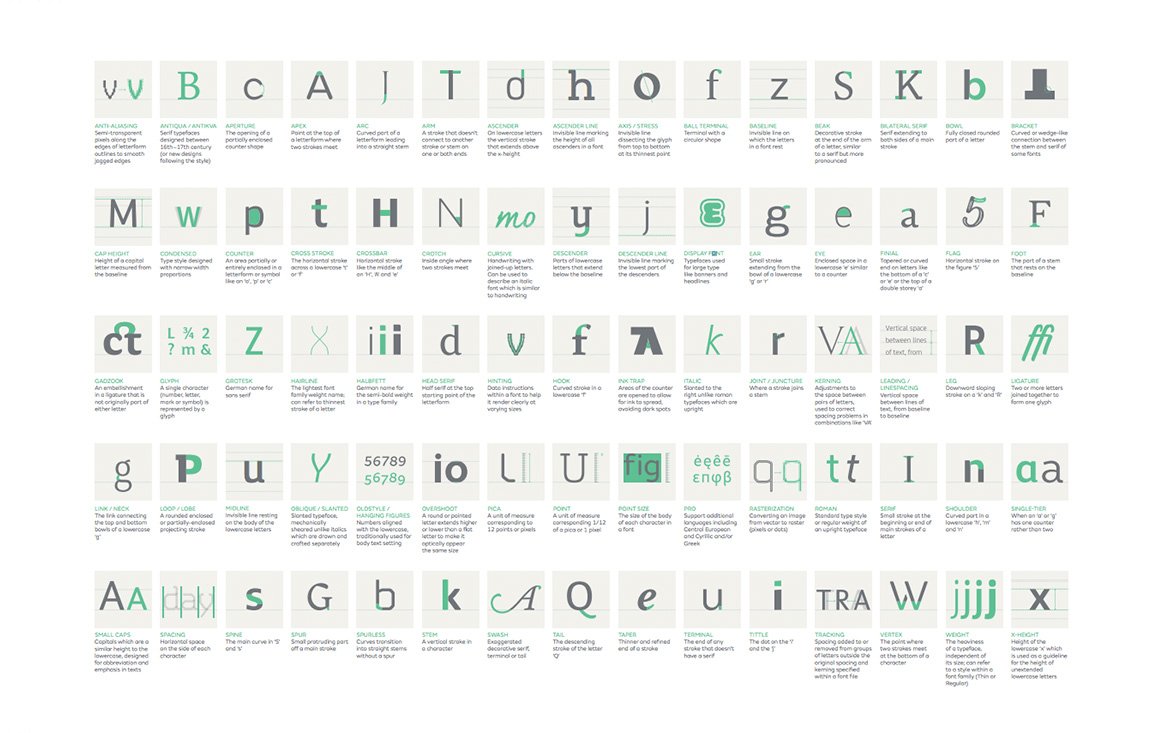
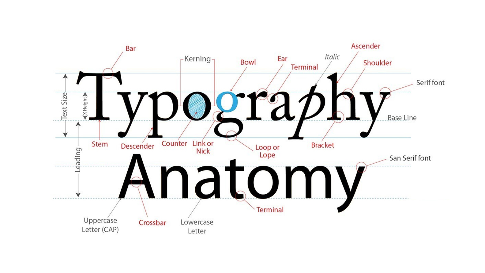
type = 글 자체
typeface = 글꼴의 형태 및 양식
typo = 타이포그래퍼의 줄임말 혹은 오탈자
type design = 글꼴을 디자인 하는 행위
typographer = 디자인 된 글꼴을 선택하고 배열하는 사람
typography[일반적인] = 디자인 된 글꼴을 선택하고 배열하는 행위
typography[전문분야] = 타입을 다루는 사람들의 전문적인 양식 및 기법
‘타이포’라는 잘못된 표현에 대한 문제제기에서 출발하여, 타이포그래피 분야의 용어에 대해 간단히 정리해 보았다. 단어의 정확한 의미는 특정 전문분야에서 대단히 중요한 부분이지만 한편으로는 항상 간과되는 부분들이기도 하다. 그래서 언제나 자신의 전공분야에 대한 단어들은 그 의미에 맞게 사용되었는지 항상 조심하고 신경써야 한다.
한 연구에 따르면 사용자 인터페이스의 70%는 다른 사람과 의사 소통하는 가장 좋은 방법으로 타이포그래피에 의존한다고 한다.
타이포그래피는 사용자 인터페이스에서 중요한 역할을하며, 타이포그래피 디자인을 개선하는 것은 UI와 UX를 개선하는 중요한 단계이다.
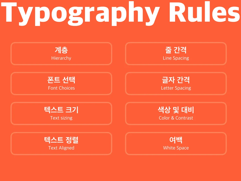
사용자 중심 디자인은 전자 책 또는 블로그 테마 디자인과는 다르다. 비록 유형 중심 디자인의 원리가 여전히 기술을 적용하고 있지만 UI에서 더 나은 타이포그래피를 위한 8가지 규칙이 있다.
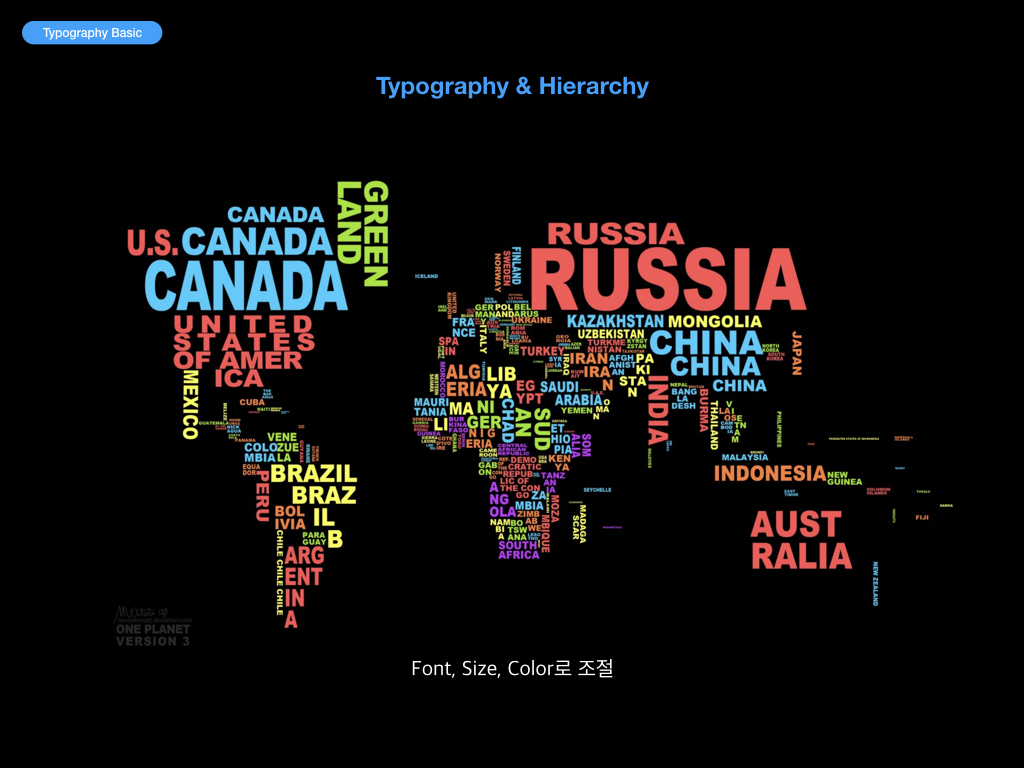
1. Hierarchy
콘텐츠를 효과적으로 전달하기 위한 가장 중요한 기술 중 하나는 타이포그래피 계층을 사용하는 것이다.
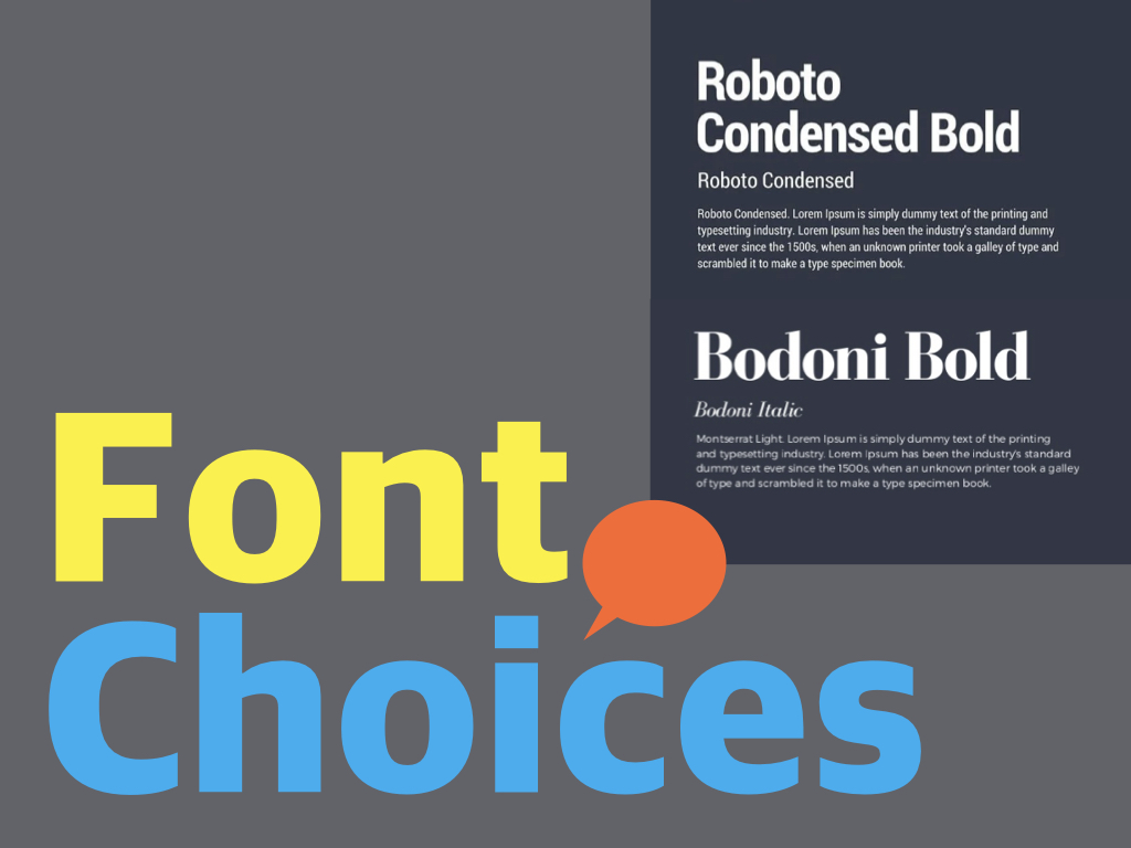
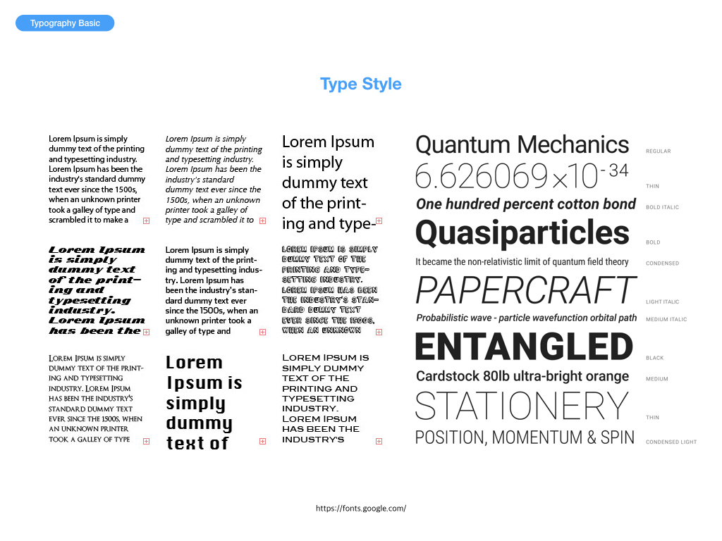
2. Font Choices
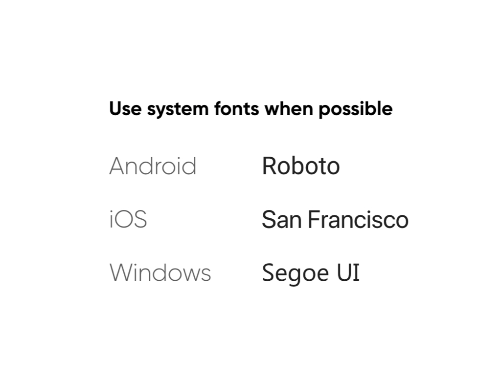
잘 알려진 안정된 소스 중에서 선택한다.
Sans-Serif 또는 Serif 는 안전한 선택이다.
다양한 크기에서 잘 작동하는 서체를 선택하는 것이 중요하다.
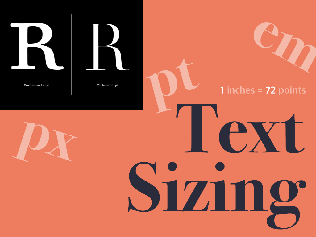
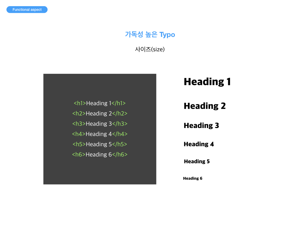
3. Text Sizing
상대단위와 절대단위
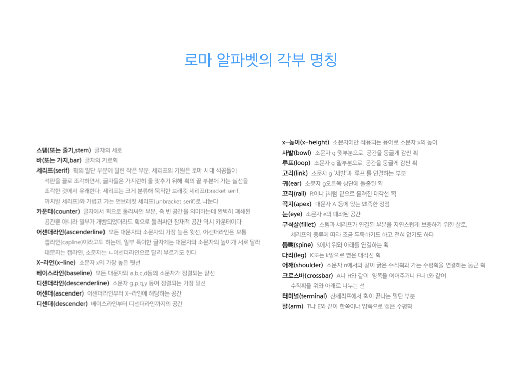
[ 절대단위 ] cm : 센티미터 mm : 밀리미터, cm 의 1/10 pc : 1pc 는 12 pt pt : 12pt 는 16px in : 1in 2.54cm
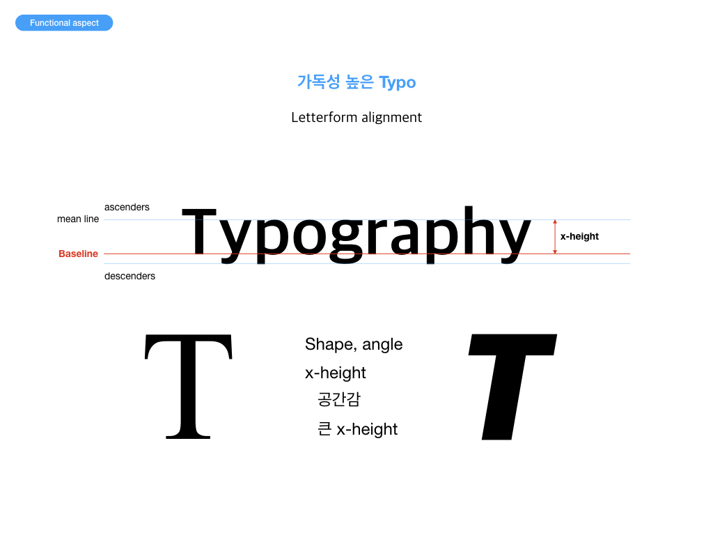
[ 상대단위 ] px : pixel, 모니터에 따라서 상대적인 크기를 갖음 em : font-size, 일반적으로 해당 폰트의 대문자 M의 너비를 기준으로 함 ex : x-height, 해당 폰트의 소문자 x의 높이를 기준으로 함 % : 브라우저 기본 글꼴 크기를 100% 하고 상대적 크기를 나타냄
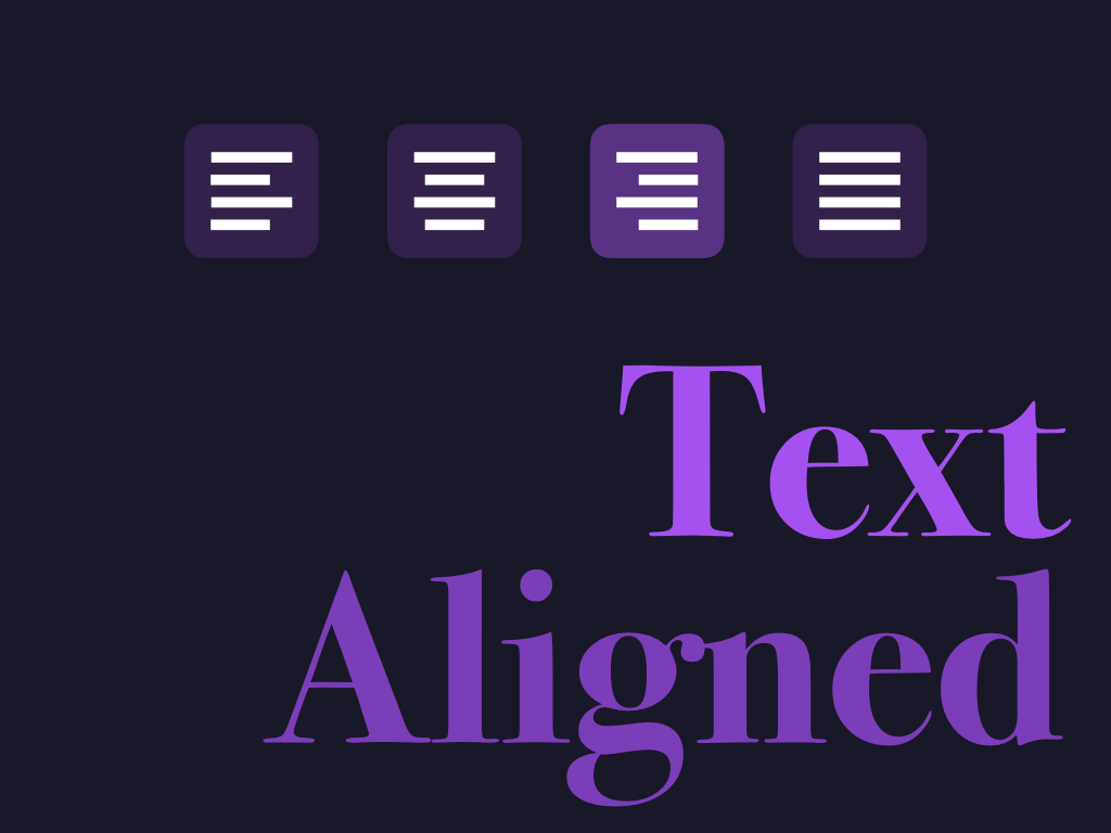
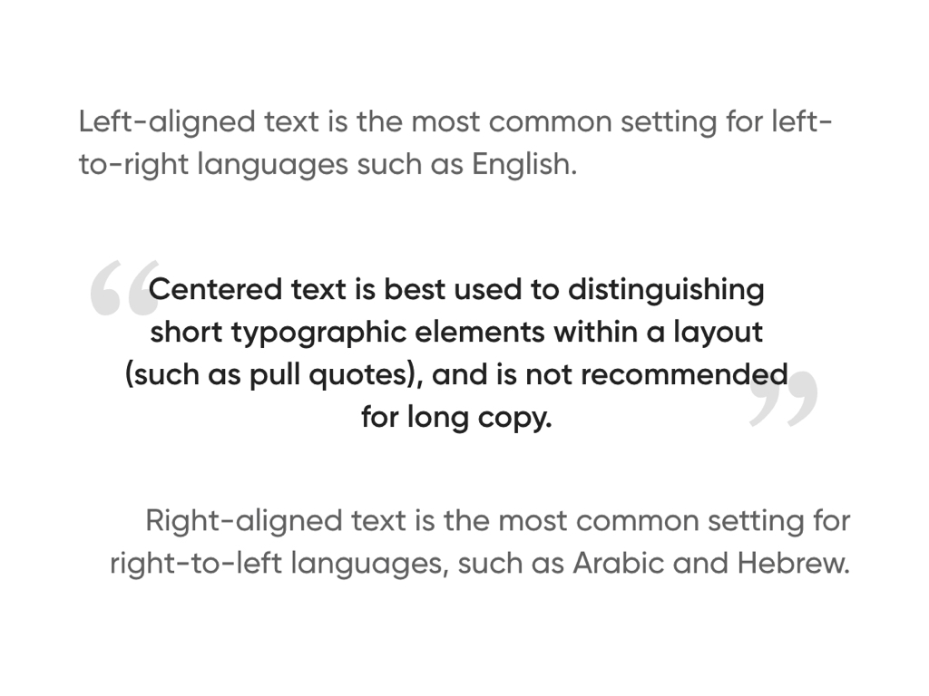
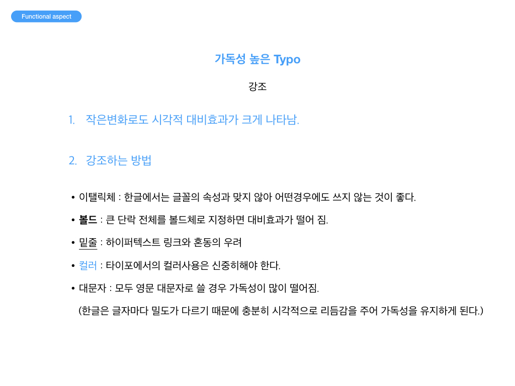
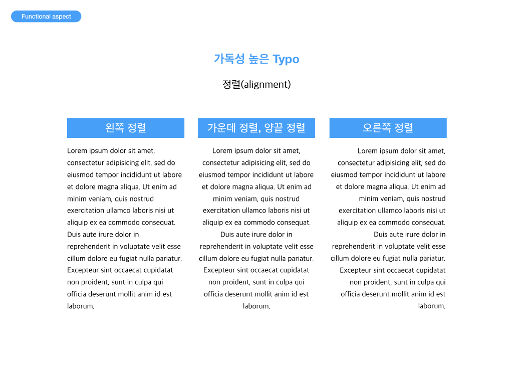
4. Text Aligned
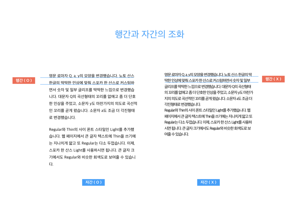
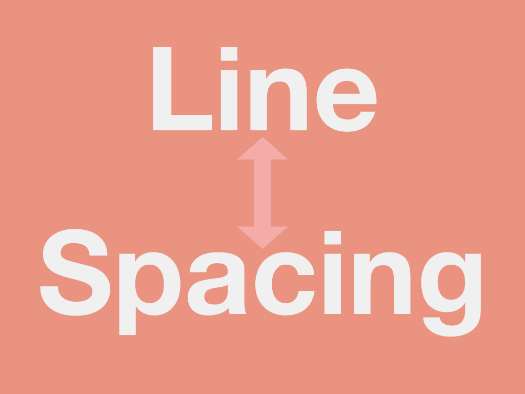
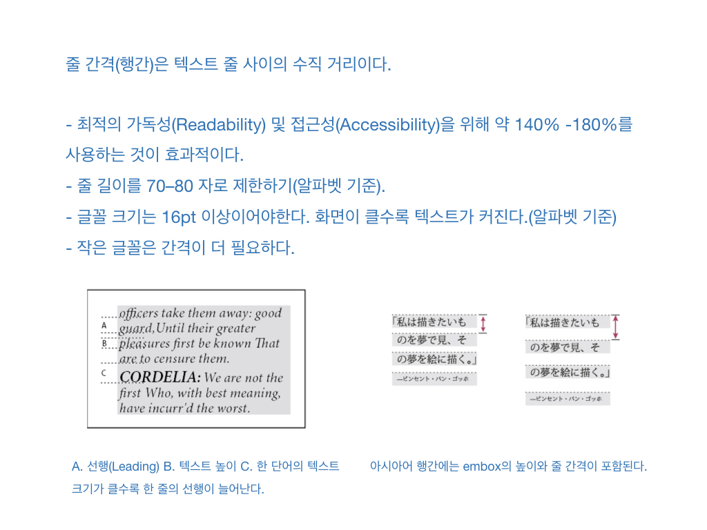
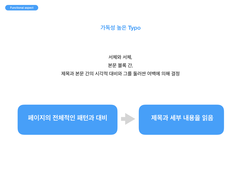
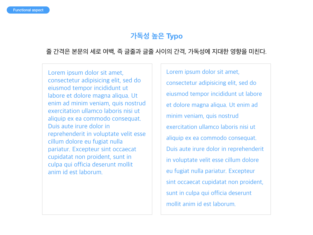
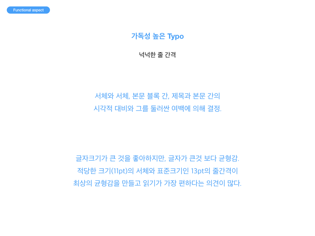
5. Line Spacing
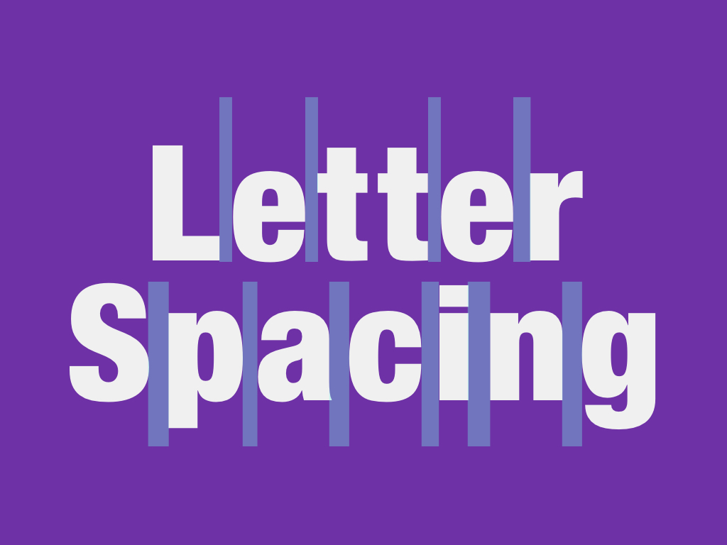
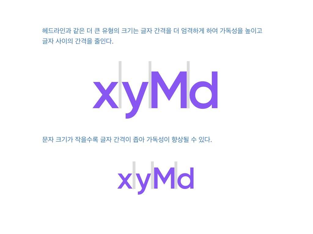
6. Letter Spacing
헤드라인과 같은 더 큰 유형의 크기는 글자 간격을 더 엄격하게 하여 가독성을 높이고 글자 사이의 간격을 줄인다. 문자 크기가 작을수록 글자 간격이 좁아 가독성이 향상될 수 있다.
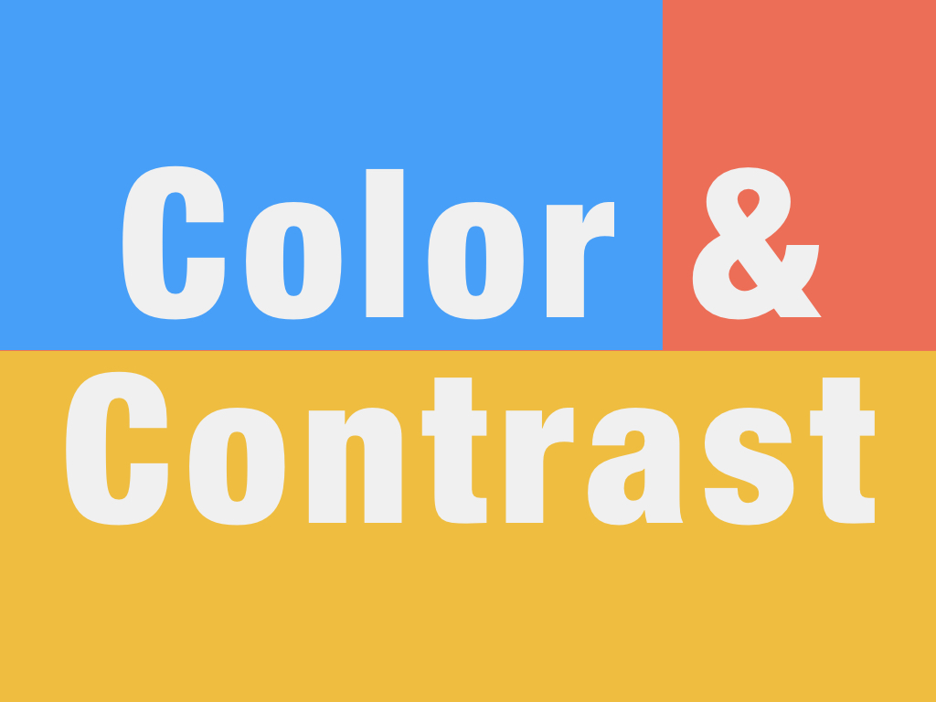
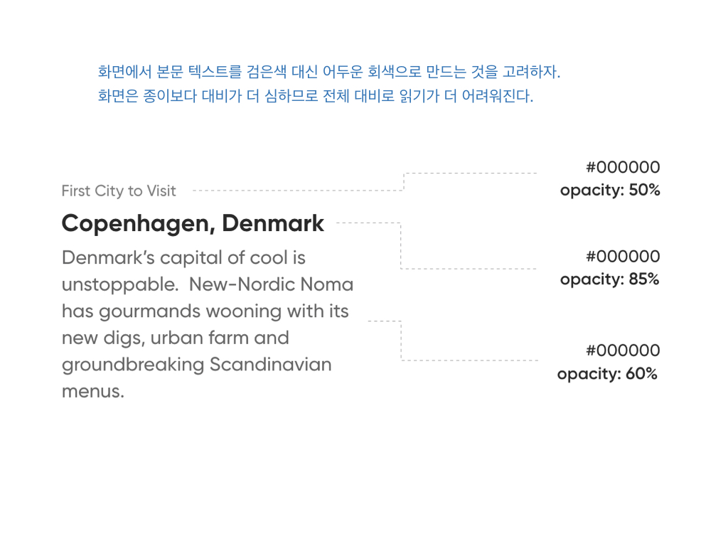
7. Color & Contrast
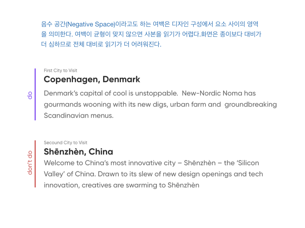
화면에서 본문 텍스트를 검은색 대신 어두운 회색으로 만드는 것을 고려하자. 화면은 종이보다 대비가 더 심하므로 전체 대비로 읽기가 더 어려워진다.
8. White Space
음수 공간(Negative Space)이라고도 하는 여백은 디자인 구성에서 요소 사이의 영역을 의미한다. 여백이 균형이 맞지 않으면 사본을 읽기가 어렵다.
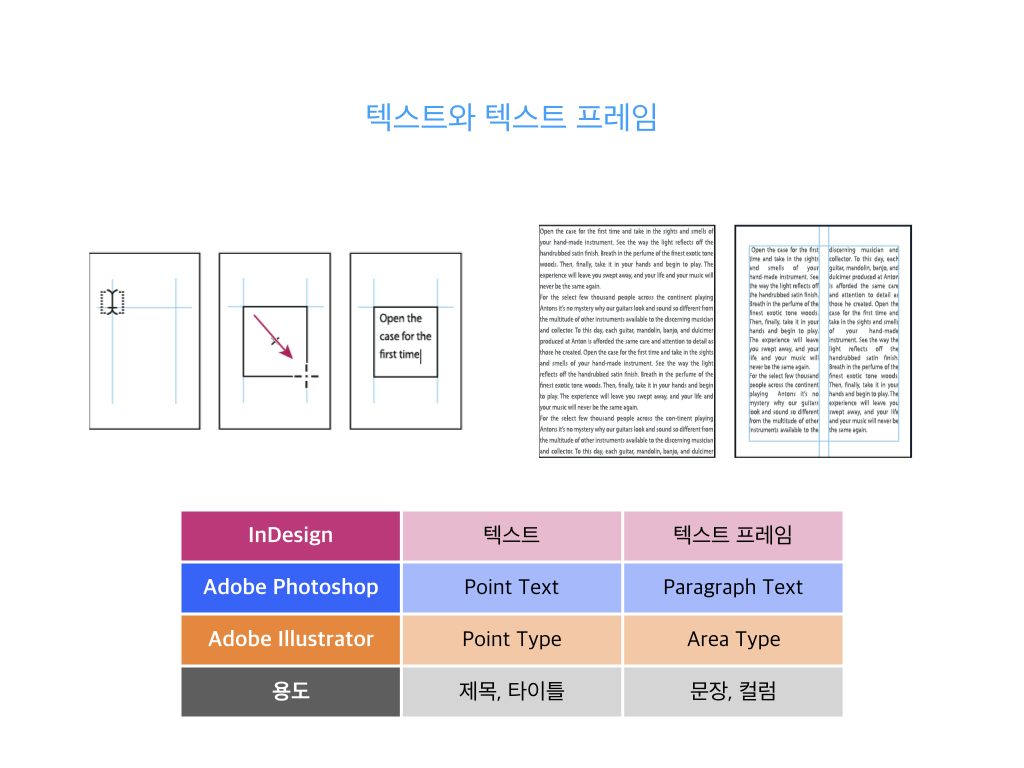
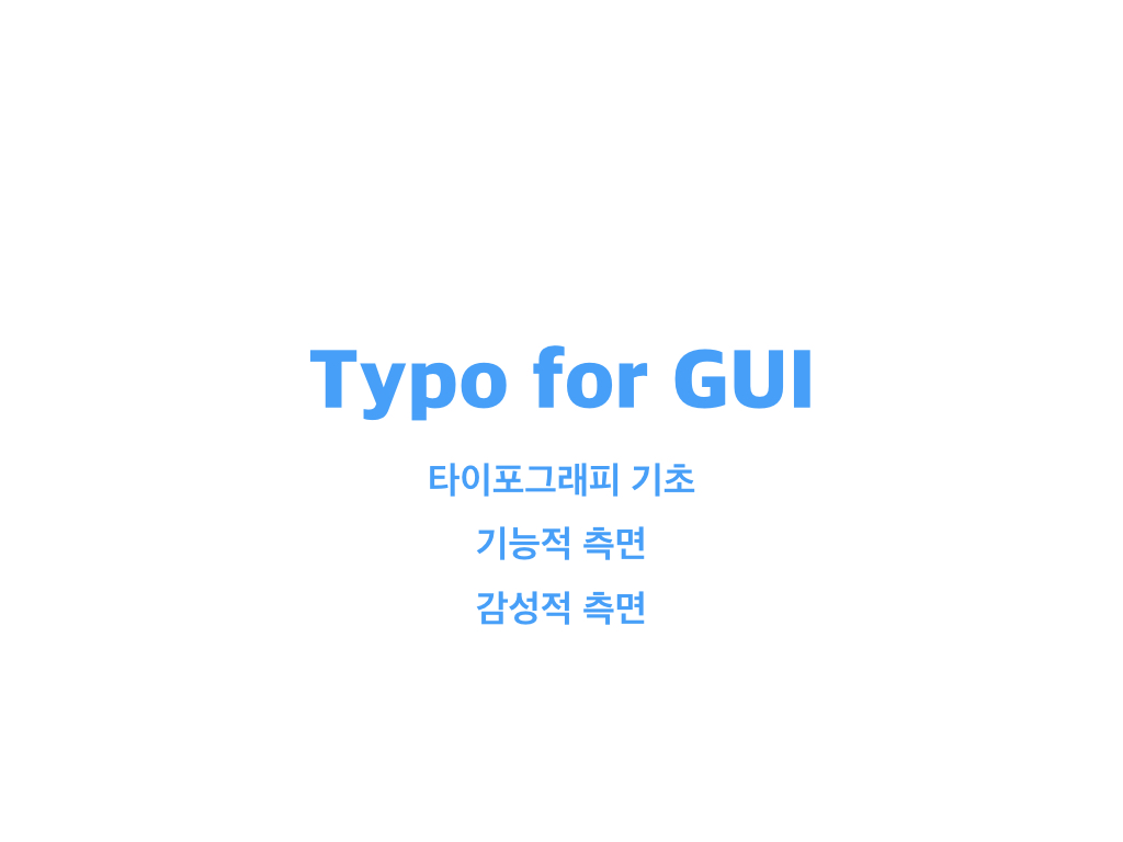
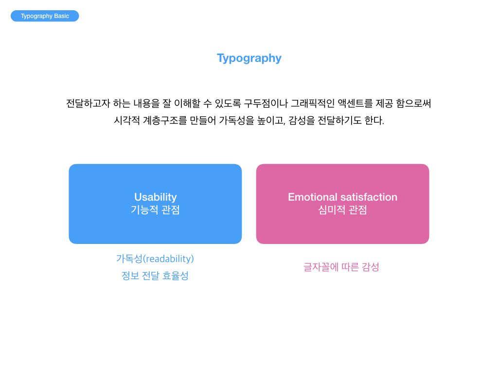
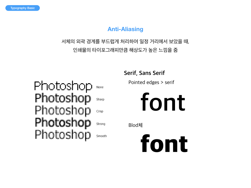
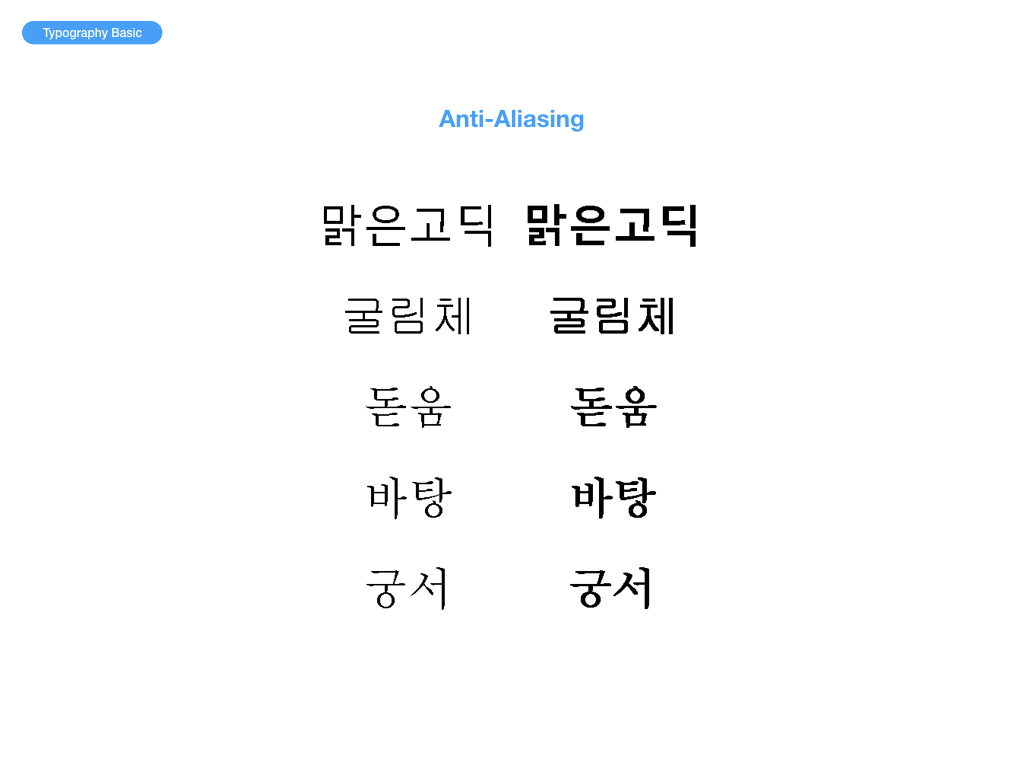
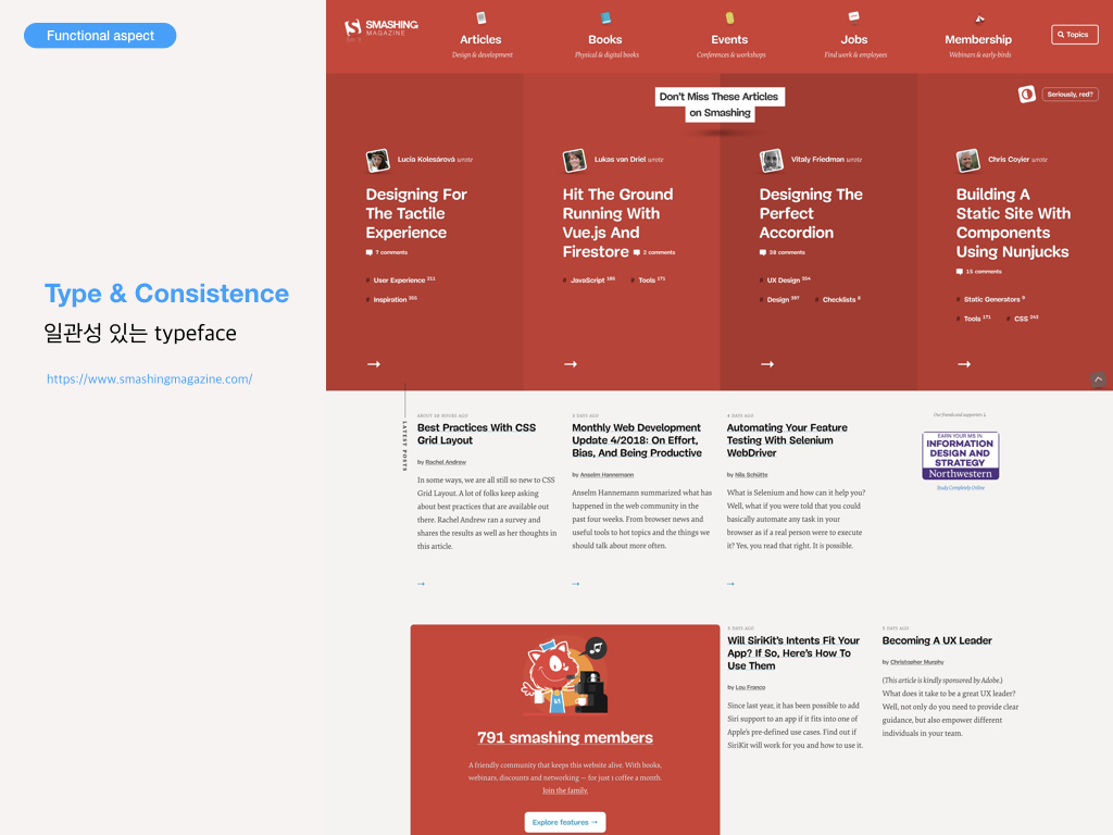
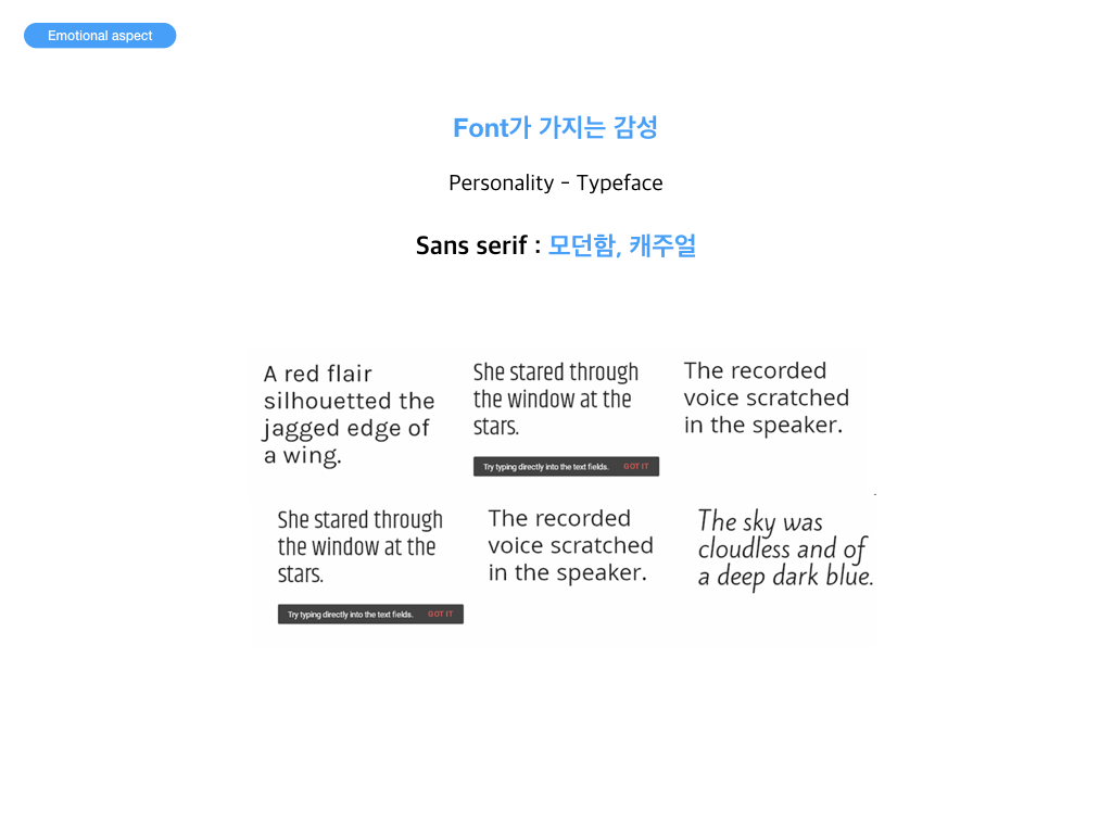
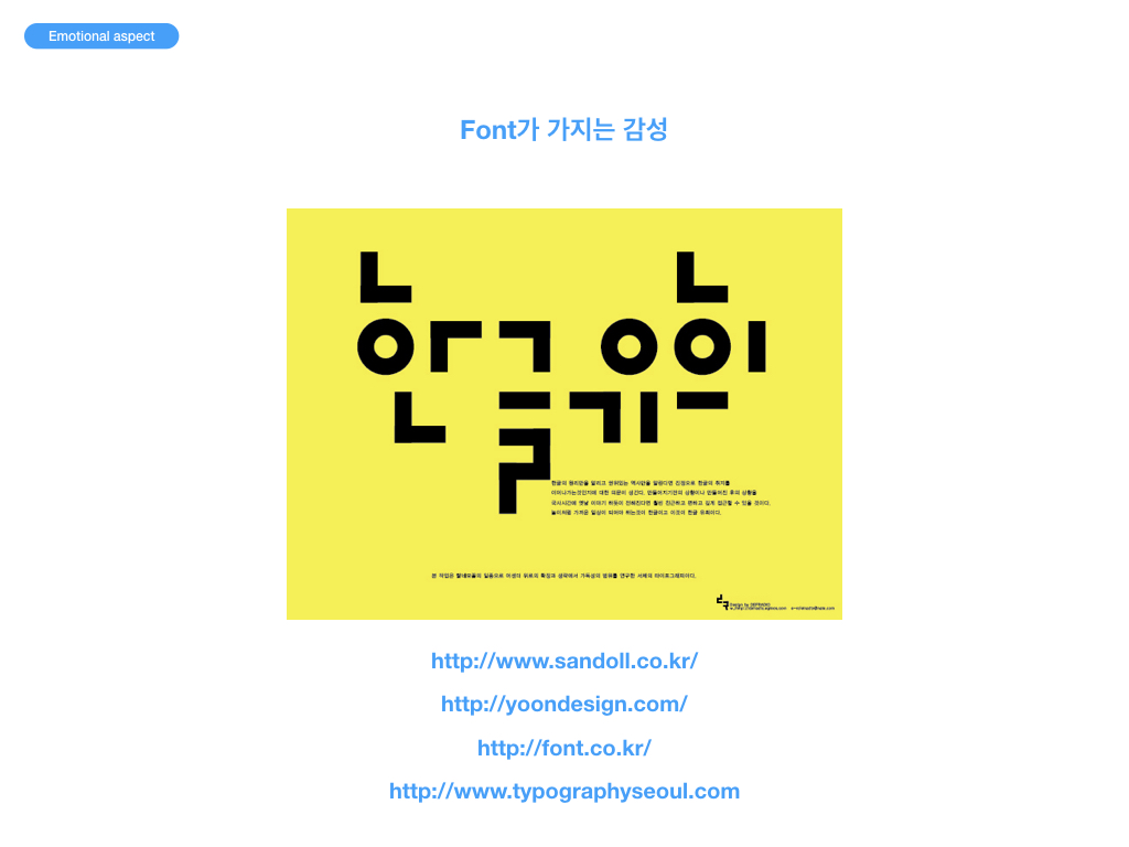
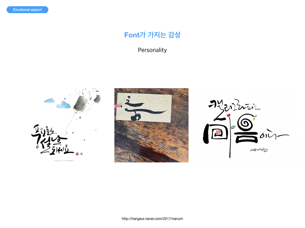
타이포그래피는 활자 서체의 배열을 말하는데, 특히 문자 또는 활판 적 기호를 중심으로 한 2차원적 표현을 가리킨다. 활판으로 하는 인쇄술을 가리키는 용어이기도 하다. 오늘날에는 뜻이 바뀌어 사진까지도 첨가하여 구성적인 그래픽 디자인 전체를 가리키고 일반의 디자인과 동의어 같이 쓰이는 일도 있다. 즉, 편집 디자인 분야에서는 활자의 서체나 글자 배치 따위를 구성하고 표현하는 일을 가리킨다. 하지만 감성적 측면에 관한 타이포에 관한 부분은 흔히 간과하기가 쉽다. Sarah의 이야기를 듣고 참고하기를 기대한다.
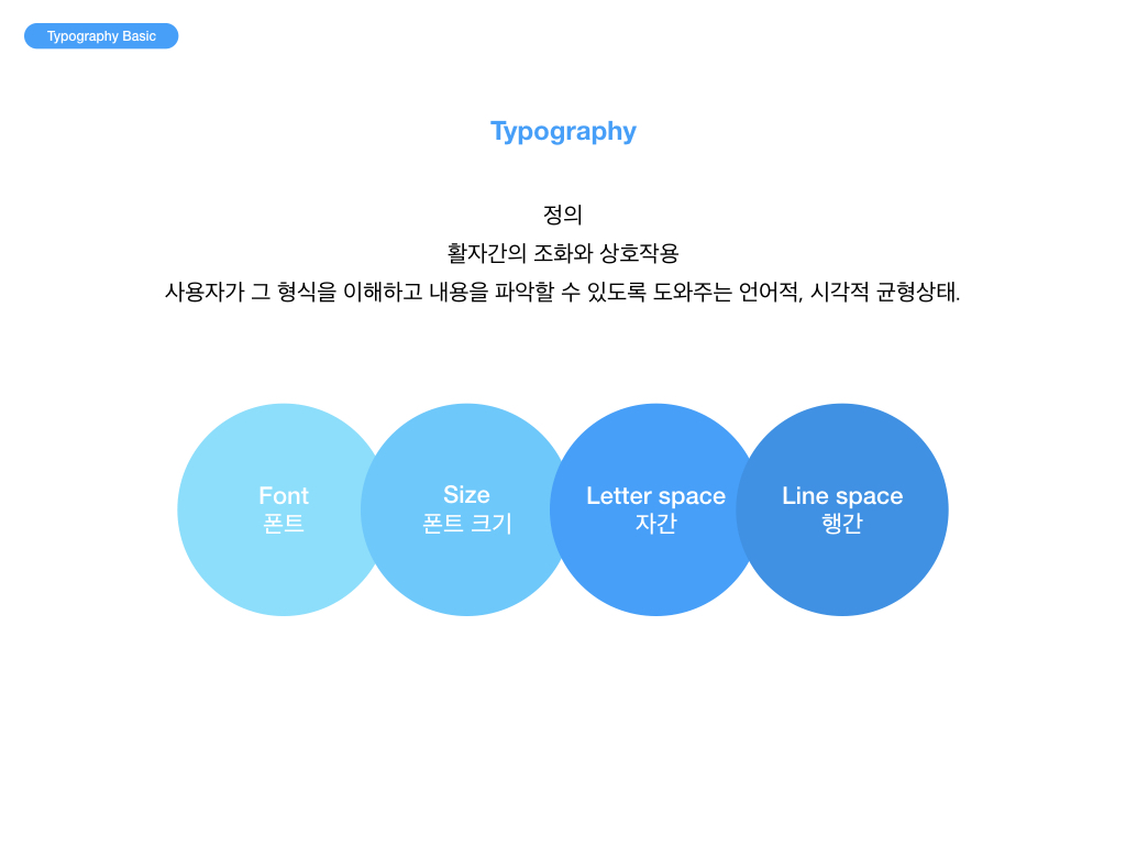
Typography Basic
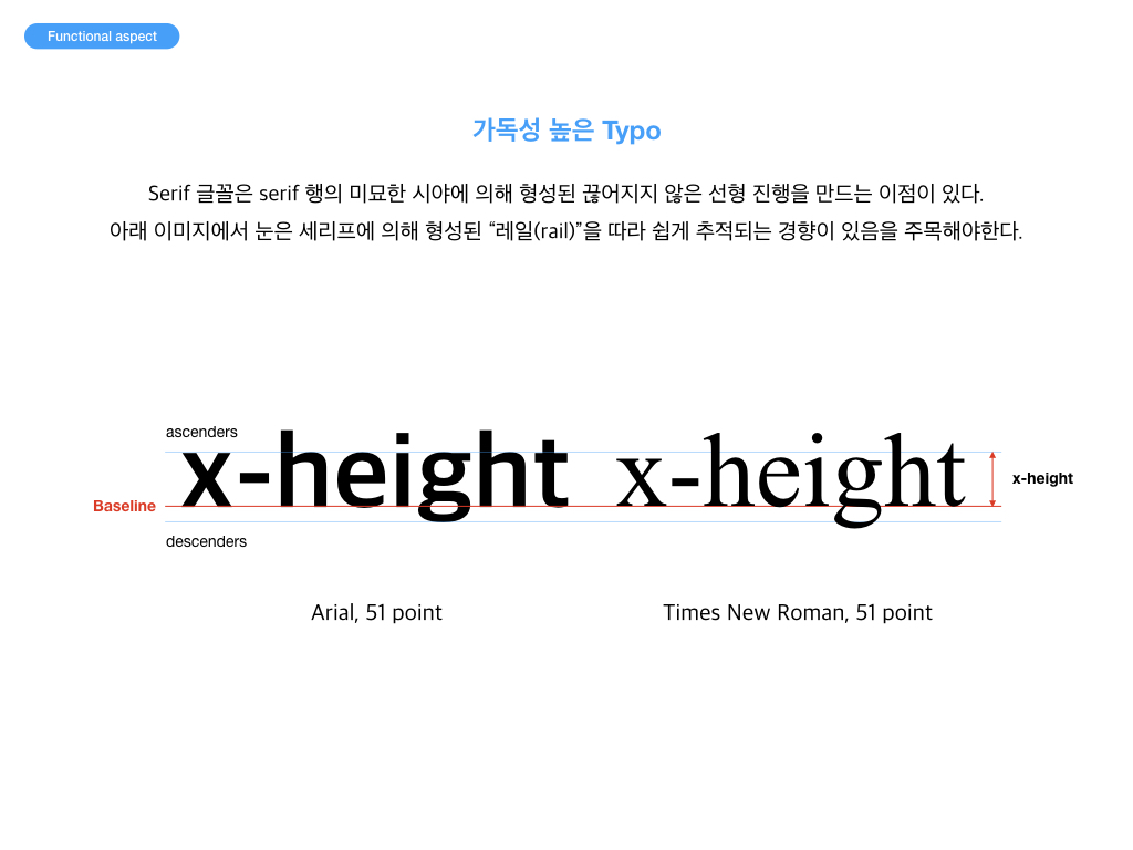
Functional aspect
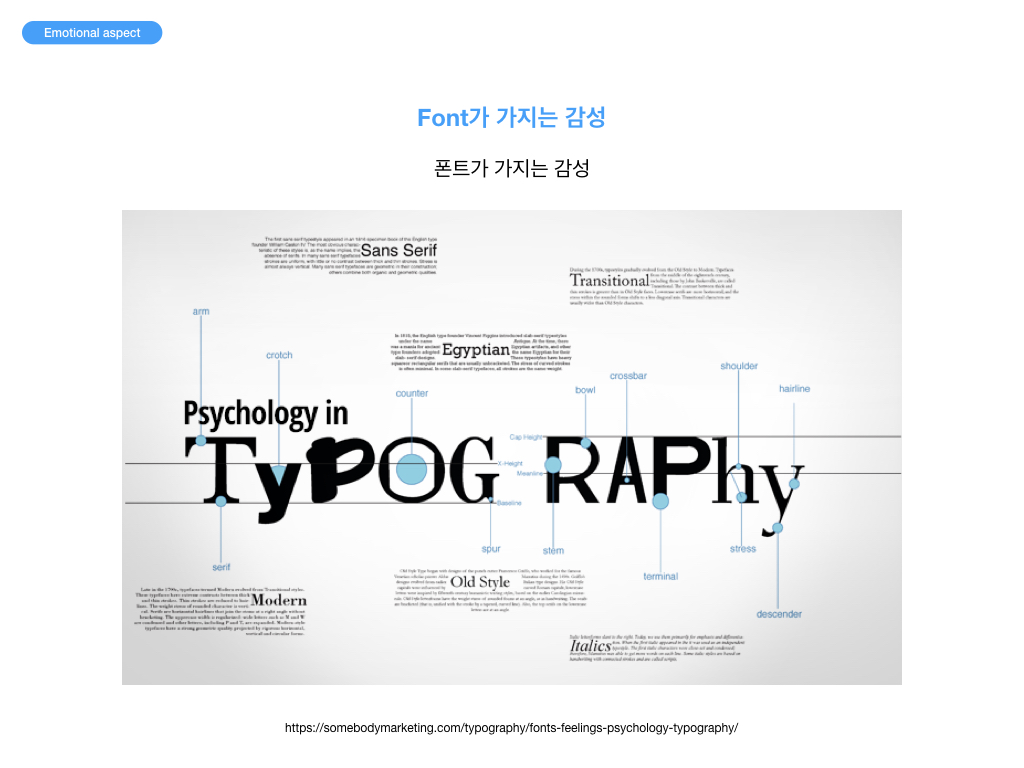
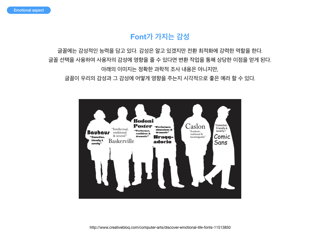
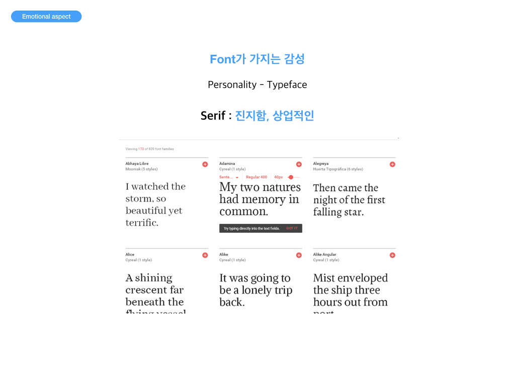
Emotional aspects
질의응답
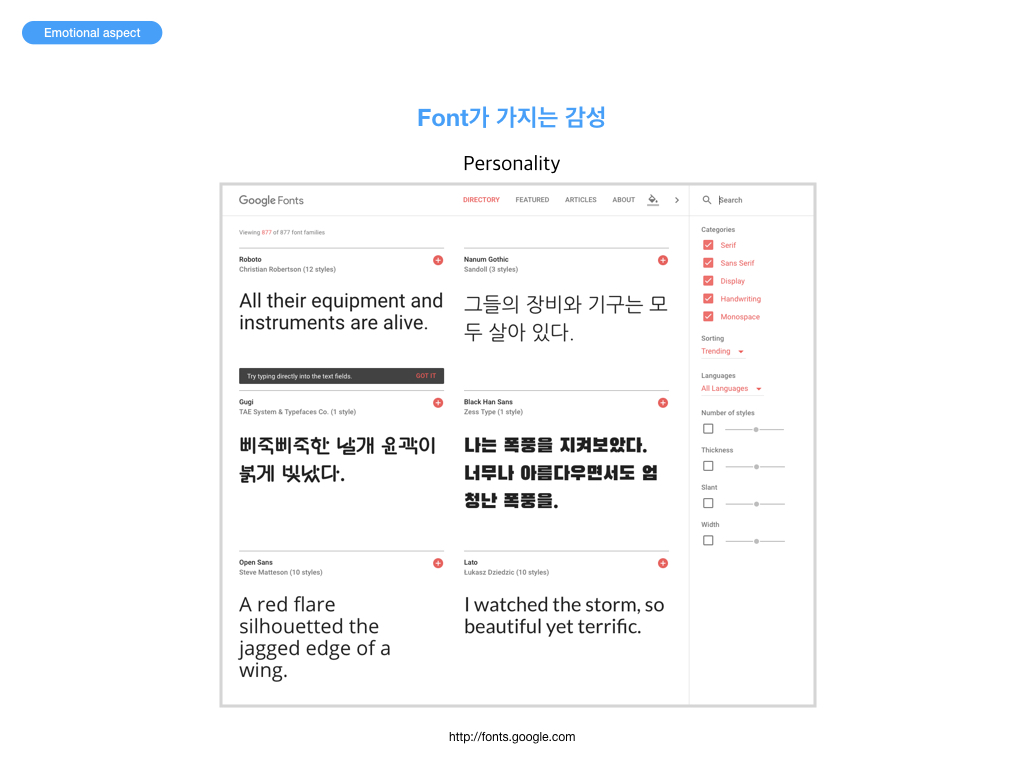
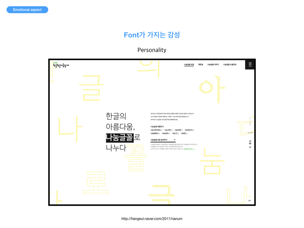
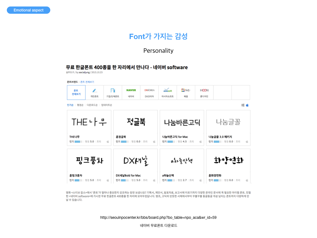
내가 선택한 폰트가 내가 전달하려는 감성과 잘 일치하는지, 감성을 전달하기에 충분한지 생각해보자. 미세먼지 프로젝트를 중심으로 App Style Guide 작성시 고려할것
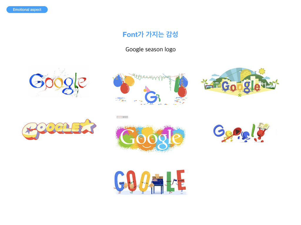
폰트가 가지는 다양한 감성들에 대해 생각해보자. 다양한 타이포그래피 디자인들을 살펴보고 내가 전달하고자 하는 감성(예: 유쾌 발랄)과 유사하거나 비슷한 감성을 가진 디자인을 찾아보자. 미세먼지 앱에 적용될 내용 등에서 타이포그래피를 활용하는 방법에 대해 고민해보고 구체적인 아이디어나 계획을 댓글로 달아보자.
내 프로젝트의 각 페이지에서 가독성을 좀 더 높이기 위해 어떤 방법을 사용할 것인지 생각해보고 적어보자. 예) 줄간격, 행간, 여백, 서체 등
Bold, italics, case 및 줄 간격(line-height) : font-weight, font-style, font-variant, text-transform, line-height
<!DOCTYPE html>
<html>
<head>
    <meta charset="utf-8">
    <title>Bold, italics, case와 line-height</title>
    <style>
        body {
            font-size: 25px;
        }
        p {
            margin: 50px 0;
        }
        code {
            color: #c00;
        }
        #p1 {
            font-weight: bold;
        }
        #p2 {
            font-style: italic;
        }
        #p3 {
            font-variant: small-caps;
        }
        #p4 {
            text-transform: uppercase;
        }
        #p5 {
            line-height: 2;
        }
    </style>
</head>
<body>
    <p id="p1"><code>font-weight</code>: Bold or light text. Eg. <code>font-weight: bold;</code></p>
    <p id="p2"><code>font-style</code>: Italic or oblique text. Eg. <code>font-style: italic;</code></p>
    <p id="p3"><code>font-variant</code>: Small capitals. Replaces lowercase letters with uppercase letters that are a similar height to the original lowercase ones. Eg. <code>font-variant: small-caps;</code></p>
    <p id="p4"><code>text-transform</code>: Converts the case of letters, to uppercase, lowercase, or capitalized. Eg. <code>text-transform: uppercase;</code></p>
    <p id="p5"><code>line-height</code>: The minimal height for a line of text. Apparnet in longer lines, such as "The green seed of the white-flowering climbing leguminous papilionaceous plant, <em>Pisum sativum</em>, has become a dining-table favourite for good reason. The <strong>perfect</strong> accompaniment to any meal, the diminutive spherical vegetables brings joy to billions worldwide, be they fresh, frozen, canned or dried." Eg. <code>line-height: 2;</code></p>
</body>
</html>
Font families : 글꼴 패밀리(font-family) 목록 및 일반 대체 글꼴 패밀리(generic fallback font families)
<!DOCTYPE html>
<html>
<head>
    <meta charset="utf-8">
    <title>Font families</title>
    <style>
        h2 { color: green; }

        #p1 { font-family: Times, "Times New Roman", serif; }
        #p2 { font-family: Helvetica, Arial, sans-serif; }
        #p3 { font-family: serif; }
        #p4 { font-family: sans-serif; }
        #p5 { font-family: monospace; }
        #p6 { font-family: cursive; }
        #p7 { font-family: fantasy; }

        .s1 { font-style: italic; }
        .s2 { font-style: oblique; }
        .s3 { font-weight: bold; }
        .s4 { font-weight: 100; }
    </style>
</head>
<body>
    <h1>Font Families</h1>
    <p>Used with CSS. Two common font combination lists and the five generic fallback font families.</p>
    <h2>font-family: Times, "Times New Roman", serif</h2>
    <p id="p1">
            Behold! A serif font family list!
            <span class="s1">It swooshes with an italic font-style!</span>
            <span class="s2">It leans with an oblique font-style!</span>
            <span class="s3">It puffs out with a bold font-weight!</span>
            <span class="s4">It sucks in with a 100 font-weight!</span>
    </p>
    <h2>font-family: Helvetica, Arial, sans-serif</h2>
    <p id="p2">
            Behold! A sans-serif font family list!
            <span class="s1">It swooshes with an italic font-style!</span>
            <span class="s2">It leans with an oblique font-style!</span>
            <span class="s3">It puffs out with a bold font-weight!</span>
            <span class="s4">It sucks in with a 100 font-weight!</span>
    </p>
    <h2>font-family: serif</h2>
    <p id="p3">
            Behold! The serif generic font family!
            <span class="s1">It swooshes with an italic font-style!</span>
            <span class="s2">It leans with an oblique font-style!</span>
            <span class="s3">It puffs out with a bold font-weight!</span>
            <span class="s4">It sucks in with a 100 font-weight!</span>
    </p>
    <h2>font-family: sans-serif</h2>
    <p id="p4">
            Behold! The sans-serif generic font family!
            <span class="s1">It swooshes with an italic font-style!</span>
            <span class="s2">It leans with an oblique font-style!</span>
            <span class="s3">It puffs out with a bold font-weight!</span>
            <span class="s4">It sucks in with a 100 font-weight!</span>
    </p>
    <h2>font-family: monospace</h2>
    <p id="p5">
            Behold! The monospace generic font family!
            <span class="s1">It swooshes with an italic font-style!</span>
            <span class="s2">It leans with an oblique font-style!</span>
            <span class="s3">It puffs out with a bold font-weight!</span>
            <span class="s4">It sucks in with a 100 font-weight!</span>
    </p>
    <h2>font-family: cursive</h2>
    <p id="p6">
            Behold! The cursive font family!
            <span class="s1">It swooshes with an italic font-style!</span>
            <span class="s2">It leans with an oblique font-style!</span>
            <span class="s3">It puffs out with a bold font-weight!</span>
            <span class="s4">It sucks in with a 100 font-weight!</span>
    </p>
    <h2>font-family: fantasy</h2>
    <p id="p7">
            Behold! The fantasy generic font family!
            <span class="s1">It swooshes with an italic font-style!</span>
            <span class="s2">It leans with an oblique font-style!</span>
            <span class="s3">It puffs out with a bold font-weight!</span>
            <span class="s4">It sucks in with a 100 font-weight!</span>
    </p>
</body>
</html>
글자 간격 : text-align, text-indent, word-spacing, letter-spacing
<!DOCTYPE html>
<html>
<head>
    <meta charset="utf-8">
    <title>Text-align, text-indent, word and letter spacing</title>
    <style>
        body {
            font: 150% arial, helvetica, sans-serif;
        }
        #p5 {
            text-indent: 2em;
            word-spacing: 1em;
        }
        #p6 {
            text-align: justify;
            letter-spacing: 0.1em;
        }
    </style>
</head>
<body>
    <p id="p5">Even leaving aside the astounding nutritional package, the taste explosion and texture of a well cooked pea is undeniably enough to award this deceptively simple seed the gold-medal of the foodstuff Olympics.</p>
    <p id="p6">There is debate surrounding the tampering of the form of the original spherical vegetable. The question as to whether the 'mushy' pea is sacrilege or an innovative approach to re-package the perfect product is a sensitive issue. A similar argument arises when approaching the relatively new craze of mangetout. In-depth study is required, but for now it is too early to assess the true importance of this baby pea pod.</p>
</body>
</html>
<!DOCTYPE html>
<html>
<head>
    <meta charset="utf-8">
    <title>Superscript and subscript</title>
    <style>
        body { font: 100% "Times New Roman", Times, serif }
        p { line-height: 1.5 }
        .charge {
            position: relative;
            bottom: 0.5em;
            color: red;
            font-size: 0.8em;
        }
        .atoms {
            position: relative;
            top: 0.3em;
            color: blue;
            font-size: 0.8em;
        }
    </style>
</head>
<body>
    <p>My name is Doctor Womac and I am going to teach you all about chemical formulae. A chemical formula is a way to describe the chemical elements that make up a particular chemical compound. It consists of chemical symbols to covey the elements and numbers to show the number of atoms of each element. H<span class="atoms">2</span>SO<span class="atoms">4</span> is the chemical formula for sulphur for example. The charge of an ion can be displayed in superscript, such as Au<span class="charge">2+</span>. This concludes my lesson. I must rush off home now because I have a problem with some radioactive phosphate.</p>
</body>
</html>
<!DOCTYPE html>
<html>
<head>
    <meta charset="utf-8">
    <title>Text shadows</title>
    <style>
        body {
            font: 20px/2 "times new roman", times, serif;
            color: #000;
        }
        h1 {
            text-shadow: -2px 2px 2px #999;
        }
        em {
            font-weight: bold;
            padding: 8px;
        }
        #elephant {
            color: #eee;
            background: #999;
            text-shadow: 2px 1px 0 #000;
        }
        #plesiosaur {
            background: #bde;
            color: #06c;
            text-shadow: 0 -3px 1px #fff;
        }
        #tourist {
            color: #efa;
            background: #be0;
            text-shadow: 0 0 4px #360;
        }
    </style>
</head>
<body>
    <h1>A little tale accompanied by a little text shadow</h1>
    <p>In Botswana's Chobe National Park, <em id="elephant">an elephant with an especially large trunk</em> is minding its own business when <em id="plesiosaur">a plesiosaur with five heads, two tails, and the legs of a lion</em> falls out of the sky and lands on the elephant's back.</p>
    <p>"Hah hah! That's hilarious!", says the plesiosaur, "Your trunk is huge!"</p>
    <p><em id="tourist">A stunned tourist in a nearby Jeep</em> drops his camera, stares in amazement, and excitedly taps his wife on the shoulder.</p>
    <p>"Look, honey! That's amazing! The talking prehistoric marine reptile with five heads, two tails, and the legs of a lion that fell out of the sky is right! That elephant's trunk is ginormous!"</p>
</body>
</html>
<!DOCTYPE html>
<html>
<head>
    <meta charset="utf-8">
    <title>Drop caps 1</title>
    <style>
        body {
            font: 15px/1.5 arial, helvetica, sans-serif;
        }
        p:first-letter {
            float: left;
            font-size: 45px;
            line-height: 1;
            font-weight: bold;
            margin-right: 9px;
        }
    </style>
</head>
<body>
    <p>Once upon a time in a blueberry bubblegum land covered in pink violets that swayed to the rhythm of "My Baby Just Cares for Me" there lived a podgy yet attractive raspberry fairy called Bedooda. Bedooda was as tall as a button bush and as intelligent as a peach mystic from the Unscented Hills (not the Scented Hills - the mystics there were not too bright) and was an adored member of the raspberry family but she was an unhappy raspberry fairy. As unhappy as a lost sunfish from the Sweet Spaghetti River.</p>
</body>
</html>
<!DOCTYPE html>
<html>
<head>
    <meta charset="utf-8">
    <title>Fancy drop caps</title>
    <style>
        body {
            font: 15px/1.5 arial, helvetica, sans-serif;
        }
        p:first-letter {
            float: left;
            font-size: 45px;
            line-height: 1;
            font-weight: bold;
            margin-right: 9px;
            color: #9c0;
            font-family: "Times New Roman", Times, serif;
            text-shadow: #690 .05em .05em;
        }
    </style>
</head>
<body>
    <p>Once upon a time in a blueberry bubblegum land covered in pink violets that swayed to the rhythm of "My Baby Just Cares for Me" there lived a podgy yet attractive raspberry fairy called Bedooda. Bedooda was as tall as a button bush and as intelligent as a peach mystic from the Unscented Hills (not the Scented Hills - the mystics there were not too bright) and was an adored member of the raspberry family but she was an unhappy raspberry fairy. As unhappy as a lost sunfish from the Sweet Spaghetti River.</p>
</body>
</html>
<!DOCTYPE html>
<html>
<head>
    <meta charset="utf-8">
    <title>Drop caps 2</title>
    <style>
        body {
            font: 15px/2 arial, helvetica, sans-serif;
        }
        p:first-letter {
            float: left;
            font-size: .1px;
            background: url("./img/o.gif") no-repeat;
            padding: 50px 0 0 40px;
            margin-right: 9px;
        }
    </style>
</head>
<body>
    <p>Once upon a time in a blueberry bubblegum land covered in pink violets that swayed to the rhythm of "My Baby Just Cares for Me" there lived a podgy yet attractive raspberry fairy called Bedooda. Bedooda was as tall as a button bush and as intelligent as a peach mystic from the Unscented Hills (not the Scented Hills - the mystics there were not too bright) and was an adored member of the raspberry family but she was an unhappy raspberry fairy. As unhappy as a lost sunfish from the Sweet Spaghetti River.</p>
</body>
</html>
<!DOCTYPE html>
<html>
<head>
    <meta charset="utf-8">
    <title>Drop caps 3</title>
    <style>
        body {
            font: 15px/2 arial, helvetica, sans-serif;
        }
        p:first-of-type:first-letter {
            float: left;
            font-size: 45px;
            line-height: 1;
            font-weight: bold;
            margin-right: 9px;
        }
    </style>
</head>
<body>
    <p>Once upon a time in a blueberry bubblegum land covered in pink violets that swayed to the rhythm of "My Baby Just Cares for Me" there lived a podgy yet attractive raspberry fairy called Bedooda.</p>
    <p>Bedooda was as tall as a button bush and as intelligent as a peach mystic from the Unscented Hills (not the Scented Hills - the mystics there were not too bright) and was an adored member of the raspberry family but she was an unhappy raspberry fairy. As unhappy as a lost sunfish from the Sweet Spaghetti River.</p>
    <p>The End.</p>
</body>
</html>
<!DOCTYPE html>
<html>
<head>
    <meta charset="utf-8">
    <title>Pull quotes 1</title>
    <style>
        body {
            font: 13px/1.5 arial, helvetica, sans-serif;
        }
        article {
            width: 500px;
        }
        .pquote {
            float: left;
            width: 100px;
            background: #ddf;
            font-weight: bold;
            padding: 13px;
            margin: 0 13px 13px 0;
        }
        blockquote {
            margin: 0;
        }
    </style>
</head>
<body>
    <article>
        <p>If ever there was evidence of God, the humble pea is it.</p>
        <p>Mother Nature has never created something of such perfection, something that takes Darwin's theory of evolution to the extent that a natural element can, over millions of years, evolve into something so flawless.</p>
        <aside class="pquote">
            <blockquote>
                <p>It is not an exaggeration to say that peas can be described as nothing less than perfect spheres of joy.</p>
            </blockquote>
        </aside>
        <p>The green seed of the white-flowering climbing leguminous papilionaceous plant, pisum sativum, has become a dining-table favourite for good reason.</p>
        <p>The perfect accompaniment to any meal, the diminutive spherical vegetable brings joy to billions worldwide, be they fresh, frozen, canned or dried.</p>
        <p>Even leaving aside the astounding nutritional package, the taste explosion and texture of a well cooked pea is undeniably enough to award this deceptively simple seed the gold-medal of the foodstuff Olympics.</p>
        <p>There is debate surrounding the tampering of the form of the original spherical vegetable. The question as to whether the 'mushy' pea is sacrilege or an innovative approach to re-package the perfect product is a sensitive issue. A similar argument arises when approaching the relatively new craze of mangetout. In-depth study is required, but for now it is too early to assess the true importance of this baby pea pod.</p>
        <p>In its original form, the pea is a giant amongst food products and a deity of the vegetable world. It is not an exaggeration to say that peas can be described as nothing less than perfect spheres of joy.</p>
    </article>
</body>
</html>
<!DOCTYPE html>
<html>
<head>
    <meta charset="utf-8">
    <title>Pull quotes 2</title>
    <style>
        body {
            font: 13px/1.5 arial, helvetica, sans-serif;
        }
        article {
            width: 500px;
        }
        .pquote {
            float: right;
            width: 200px;
            background-image: url("./img/openquote.gif") top left no-repeat;
            color: #030;
            font-size: 26px;
            line-height: 0.9;
            font-style: italic;
            padding: 13px;
        }
        blockquote {
            margin: 0;
        }
        .pquote p:first-letter {
            font-size: 39px;
            font-weight: bold;
        }
    </style>
</head>
<body>
    <article>
        <p>If ever there was evidence of God, the humble pea is it.</p>
        <p>Mother Nature has never created something of such perfection, something that takes Darwin's theory of evolution to the extent that a natural element can, over millions of years, evolve into something so flawless.</p>
        <aside class="pquote">
            <blockquote>
                <p>It is not an exaggeration to say that peas can be described as nothing less than perfect spheres of joy.</p>
            </blockquote>
        </aside>
        <p>The green seed of the white-flowering climbing leguminous papilionaceous plant, pisum sativum, has become a dining-table favourite for good reason.</p>
        <p>The perfect accompaniment to any meal, the diminutive spherical vegetable brings joy to billions worldwide, be they fresh, frozen, canned or dried.</p>
        <p>Even leaving aside the astounding nutritional package, the taste explosion and texture of a well cooked pea is undeniably enough to award this deceptively simple seed the gold-medal of the foodstuff Olympics.</p>
        <p>There is debate surrounding the tampering of the form of the original spherical vegetable. The question as to whether the 'mushy' pea is sacrilege or an innovative approach to re-package the perfect product is a sensitive issue. A similar argument arises when approaching the relatively new craze of mangetout. In-depth study is required, but for now it is too early to assess the true importance of this baby pea pod.</p>
        <p>In its original form, the pea is a giant amongst food products and a deity of the vegetable world. It is not an exaggeration to say that peas can be described as nothing less than perfect spheres of joy.</p>
    </article>
</body>
</html>
<!DOCTYPEhtml><html><head><metacharset="utf-8"><title>Pull quotes 3</title><style>body {font: 13px/1.5arial, helvetica, sans-serif; }article {width: 500px; }.quotebox {float: left;width: 200px;background-color: #900;background-image: url(./img/face-01.jpg) topno-repeat;color: #fc0;font-size: 12px;line-height: 1.2;padding-top: 71px;border: 2pxsolid#600;margin: 012px12px0; }.quoteboxp {margin: 0; }.quoteboxblockquote {font-weight: bold;padding: 6px;border-top: 2pxsolid#600;margin: 0; }.quotebox.by {padding: 6px; } </style></head><body> <article> <p>If ever there was evidence of God, the humble pea is it.</p> <p>Mother Nature has never created something of such perfection, something that takes Darwin's theory of evolution to the extent that a natural element can, over millions of years, evolve into something so flawless.</p> <aside class="quotebox"> <blockquote> <p>It is my educated opinion that this is complete and utter tosh.</p> </blockquote> <p class="by">Patrick Griffiths (pea farmer)</p> </aside> <p>The green seed of the white-flowering climbing leguminous papilionaceous plant, pisum sativum, has become adining-table favourite for good reason.</p> <p>The perfect accompaniment to any meal, the diminutive spherical vegetable brings joy to billions worldwide, be they fresh, frozen, canned or dried.</p> <p>Even leaving aside the astounding nutritional package, the taste explosion and texture of a well cooked pea is undeniably enough to award this deceptively simple seed the gold-medal of the foodstuff Olympics.</p> <p>There is debate surrounding the tampering of the form of the original spherical vegetable. The question as to whether the 'mushy' pea is sacrilege or an innovative approach to re-package the perfect product is a sensitive issue. A similar argument arises when approaching the relatively new craze of mangetout. In-depth study is required, but for now it is too early to assess the true importance of this baby pea pod.</p> <p>In its original form, the pea is a giant amongst food products and a deity of the vegetable world. It is not an exaggeration to say that peas can be described as nothing less than perfect spheres of joy.</p> </article></body></html>